


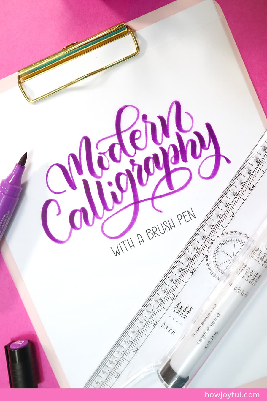
Learn how to do modern calligraphy with a brush pen (or the iPad), the correct terminology, what pens you should get, and practice sheets of the basic strokes that are fundamental to learning the art of brush calligraphy. All in one handy FREE guide, This one!

One of the things I love the most about calligraphy and lettering is the low barrier to entry, all you need to start is a pen, paper, a passion to learn something new, and some time to practice. (For calligraphy you will need a pressure sensitivity tool as well)
Calligraphy and lettering are also amazing ways to relax, practice patience, and develop skills to make beautiful artwork.
But I know that starting can be super intimidating, and at times overwhelming, that is why I am creating this series of free content to guide you and help you start in the best way possible.
In this guide, I am going to cover all the fundamentals needed to get started, so if you are a beginner, look no further! This guide is tailored just for you!
Curious about what I will be covering today?
- WHAT IS BRUSH CALLIGRAPHY?
- WHAT IS MODERN CALLIGRAPHY?
- WHAT IS BRUSH LETTERING?
- WHAT IS FAUX CALLIGRAPHY?
- LETTER FAMILIES & STYLES
- THE BEST MINDSET TO LEARN BRUSH CALLIGRAPHY
- HOW TO LEAN MODERN CALLIGRAPHY WITH A BRUSH PEN
- LEARNING RESOURCES FOR MODERN CALLIGRAPHY
- MODERN CALLIGRAPHY MATERIALS
- ANATOMY OF LETTERS
- THE OPTIMAL SET UP FOR MODERN CALLIGRAPHY
- BRUSH PEN PRESSURE BASICS
- INTRODUCTION TO THE BASIC STROKES
- FREE MODERN BRUSH CALLIGRAPHY WORKSHEET
- USING THE BASIC STROKES
- CREATING WORDS – the 3 keys
- FREQUENTLY ASKED QUESTIONS
- Looking for more letter-making goodness?
BUT before we get started with the basic terms and definitions. Download the basic strokes Workbook I prepared for you to get your practice on and exercise your muscle memory with these worksheets! Just subscribe to the newsletter below. You can also access these worksheets inside the Letter Vault. (if you are a subscriber already)
WHAT IS BRUSH CALLIGRAPHY?
Brush calligraphy as the name implies is calligraphy done with a brush pen. Essentially, we embrace the calligraphy fundamentals of the construction of letters with strokes made with different pressure (or angle), but the only tool we use to create the letters is a brush pen.

Just like in classic calligraphy, you can create any style of letters with a brush pen, but for the sake of keeping in it simple, we are only going to go in-depth on the script style of letters that you can create with a brush pen. Because that is the style I will share how to construct in the free worksheets below. (You can also read more about letter families and styles later in this article)


There are basically two different ways to construct letters with a brush pen:
a fluid construction way:
This method resembles the movement and strokes used in classic calligraphy with a dip pen when creating Copperplate style letters. This style is trendy among beginners because of social media and because of the soft flourishes and freedom associated with it.
[ Fluid method example by @jeanniedicksondesigns via IG ]
b fragmented stroke method:
Based on very fast movements, this method has a completely different way to construct letters, visually the strokes resemble Chinese Calligraphy, and the letters are constructed like you would in sign painting style.
[ Fragmented method example by David Milan @mdemilan via IG ]
IN-DEPTH POST: Are you still not sure about what is the difference between Calligraphy and Lettering? I wrote a full post about it.
What method is better for brush pen calligraphy?
I personally don’t believe one is harder than the other, and usually, it’s easier to pick the second style up once you understand the basics and practice enough of the first.
However, if you are just starting, I definitely recommend starting just with one construction style and DO NOT SWITCH to the other until you are comfortable and have developed muscle memory with the first.


What is muscle memory?
Muscle memory has been used synonymously with motor learning, which is a form of procedural memory that involves consolidating a specific motor task into memory through repetition. When a movement is repeated over time, long-term muscle memory is created for that task, eventually allowing it to be performed without conscious effort. This process decreases the need for attention and creates maximum efficiency within the motor and memory systems.
– Wikipedia
For this guide and practice sheets, I will be focusing on the fluid construction way.


WHAT IS MODERN CALLIGRAPHY?
As the name implies, modern calligraphy is a relatively new movement in the calligraphic world, where letters are NOT constructed to obey the same rules and the very particular strokes that traditional styles like Spencerian or Copperplate have to obey in order to be “correct”, also it’s mainly performed in script style.
But as with any evolution, this exploration of personal styles still has its roots in the Copperplate Calligraphic style. If you want to read more, I have an article called: History of Calligraphy: where does Calligraphy come from.
Modern calligraphy seemed like a revolution that pays less attention to the traditional rules of pointed pen script calligraphy, this revolution performs more like a fusion of styles where rules can be broken and the exploration of “personal style” is not only accepted but ENCOURAGED.

It is important to point out that when we talk about Modern calligraphy in this article we will be referring only to script style calligraphy.
Modern calligraphy can be constructed with any tool that would allow pressure sensitivity, or a variation of thickness when applying pressure or rotation.
So, while the most common tools are both a brush pen and traditional dip pen, we can also achieve this style with a very soft led pencil, with a common marker (ex. Crayola markers) and other tools.
WHAT IS BRUSH LETTERING?
Nowadays, the Brush lettering term has been popularized and wrongly used when referring to Brush calligraphy or Calligraphy created with a brush pen.
Why create a full section with a term that is used incorrectly? Because it seems like more and more people online are calling everything that they see LETTERING these days.
I know it might sound like just a pet peeve, BUT hear me out!
Just like photographers and videographers care about being called properly. Because their expertise is different even though they DO use very similar “tools” to create their work.
Lettering artists and calligraphers care about their work being appropriately described as well.
As we already established in this post about the difference between lettering and calligraphy. Lettering refers to “Drawing letters” and Calligraphy refers to “Writing letters.”
But this simple explanation can be a little hard to understand.
So, to explain further, if when you are creating letters, you erase, correct, transform, and revise your letters, what you are doing is LETTERING.
If you are making letters with strokes for every essential part of a letter, or sometimes a whole letter or word in one motion, you are doing CALLIGRAPHY.
The only time when brush lettering is used correctly is when referring to “sign painting” because while you do use a brush, you are “drawing the letters” and usually involves more than just a few strokes per word.
A great example of this and an awesome book to check out is the “Brush Lettering: And instructional manual in Western Brush Calligraphy by Marilyn Reeves & Eliza Schulte” in their book, they explain how to create a letter using paint and a brush, even though they do explain a little bit about the pointed pen.
So to reiterate:
Lettering and Calligraphy are NOT defined by the tools we are using to create the letters. BUT by the method, we are using to construct them. ~ Joy Kelley
I know the misuse of the word “lettering” can also come from a fear of the word calligraphy.
Just as an example, I’ve come across so many people that find the term “calligraphy” so intimidating because they associate it with dip pens, nibs and a very structured way to create letters (Like in the case of Spencerian or Copperplate).
Because of this, they find the word “lettering” a lot more friendly and they set in their minds that there’s no way that what they are doing is calligraphy with a brush pen, so it makes sense for them to call what they are practicing brush lettering.
I’ve also seen a lot is artist misusing the terms so that they can reach the audience that is looking to learn how to write pretty letters with a brush pen, but that have not yet lean the differences in terminology, and while this is a good tactic, is also the reason why I like to explain the differences and hopefully show you the right terms.
This way, whether you choose me to learn or someone else, you’ll know exactly what techniques you want to learn, and when purchasing books or classes you will not be disappointed by what they teach is not what you intended to get =]
Because, as we already reviewed, brush lettering, and brush calligraphy are NOT the same.
WHAT IS FAUX CALLIGRAPHY?
Another misconception that seems to be spreading around like crazy is that script letters created with pencils are called ‘faux calligraphy'. And while I could not track the exact place where this word originated from.
The use of this term is WRONG!
Let me explain:
When you create “fake calligraphy” with a pencil you are adding the thickness to the skeleton of the letter after the letter has been drawn, so you are “editing” the letter.
This makes what you are doing LETTERING, not calligraphy, and while yes you might be “faking calligraphy” that in itself is not a different term, that is simply LETTERING in a script style.
Lettering is not reserved only for Serif and Sans Serif styles. No matter the style of letters you are drawing, if you, in fact, are editing, you are doing LETTERING (script, sans serif, serif, etc.)
Now that we got all of the terms out of the way we can start calling what I am going to teach you today Modern Brush calligraphy from now on.
IN-DEPTH POST: If you want to dig deeper into history and the development of scripts check out my post about the history of Calligraphy.


LETTER FAMILIES & STYLES
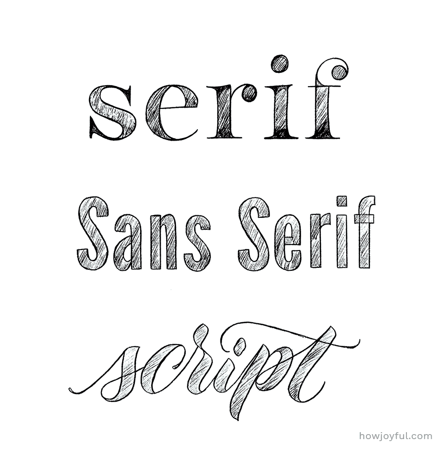
There are basically 3 families of letters, and all styles can fall under those umbrellas.
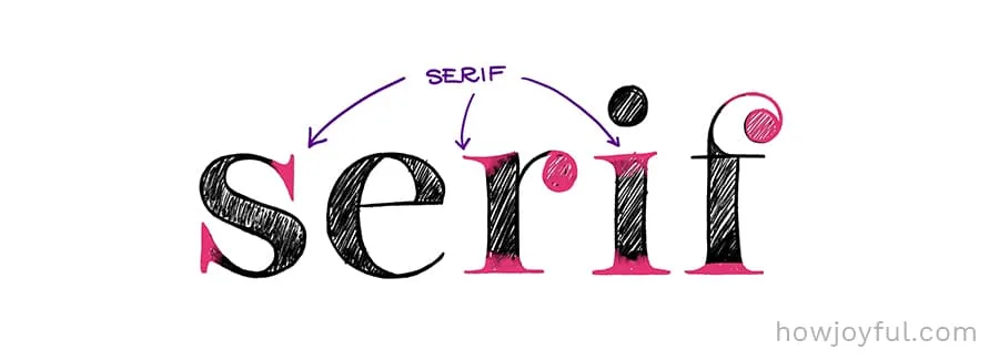
1 SERIF
Visually a serif is a terminal in the stroke of the letter. Now, the styles of serifs are pretty much endless, since we can all create our won styles of serifs, but no matter the embellishments we add, we can classify them in 4 groups that are easier to identify.


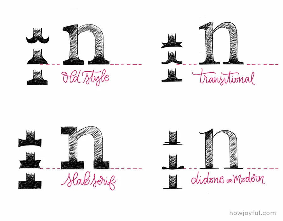
- OLD STYLE: The old-style serifs have their origin in broad-nib calligraphy. Old-style type is characterized by a lack of differences between thick and thin lines.
- TRANSITIONAL: As the name implies, it’s a transitional style in between “old style” and “modern”. It first became common around the mid-18th century until the start of the 19th century.
- DIDONE or MODERN: They first emerged in the late 18th century, and are characterized by extreme contrast between thick and thin lines. Serifs tend to be very thin, and vertical lines very heavy.
- SLAB SERIF: Originally intended as attention-grabbing designs for posters, they have very thick serifs, with little difference between thin and thick. Often considered to be less readable than transitional or old-style serif typefaces.
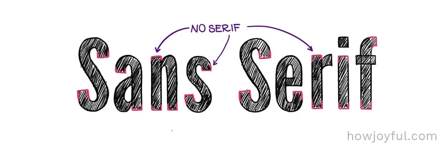
2 SANS SERIF
It is the style in which letters do not have “serifs” (bottom or top bars attached to the letterforms) An easy way to remember is that the word “SANS” means without, so the name literally means “without serifs”. They are easily recognizable because of the clean profile.
Fonts in this family are most commonly used in web design as body text. If you are reading this blog post. The body text of my blog is set in a “sans serif” font, as it's one of the easier family to read when used in blocks of text for screens.

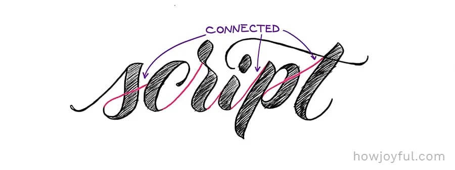
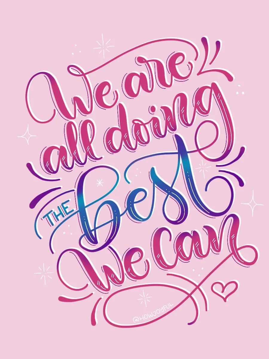
3 SCRIPT
This (very popular) style, is characterized by the fluid way where most letters in a word are connected together. It’s mostly used for display purposes, unlike serif and sans serif that is used for body text. Script styles are only recommended for titles, or to emphasize words or quotes.
It’s often used to add an edge or feminine touch (depending on the expressiveness of the strokes) to a full piece or a portion of a piece.

IN-DEPTH POST: If you want to dig deeper into the classification of type, and lettering alphabets, check out this post.
THE BEST MINDSET TO LEARN BRUSH CALLIGRAPHY
Whenever we approach learning something new, there has to be a mindset check-in to make sure we are approaching things the correct way.
If we find ourselves having the wrong expectations, or a fixed mindset when starting, we should first work on that. So that we are open to learning, and we commit to the process, this will make us less likely to give up because we are not achieving the “wrongly set milestones”
Just like when you get mentally ready to go to the gym and put in a lot of work before you can see great results.
Learning calligraphy will take time, dedication, and the belief that the practice we are investing time in will give us fruit.
We also need to work on being OK, with not being excellent after the first session, I know that some of us want to create Instagram-worthy pieces overnight. But the reality is that we will probably be bad at the beginning.
AND THAT'S OK!
We all started right at the beginning, not knowing what to do, and hoping to see improvement.
I want to assure you, that if you are reading this, and are committed to beginning your journey, it WILL be worth it and you WILL achieve success.
All you have to do is give it time and practice, practice, practice.

HOW TO LEAN MODERN CALLIGRAPHY WITH A BRUSH PEN
Learning brush calligraphy can seem super intimidating!
But it is all about practice and muscle memory, we need to train our eye, and hands to repeat movements and strokes that will later construct our letters.
Once we know how to build letters correctly (depending on the method we are using, fluid or fragmented), we can construct words, and after that, we can learn about composition, flourishes and other letter enhancing techniques.
But we have to do this one step at a time.
Walking before we can run.
I know the process might seem too long even to try, but don’t give up on me when we haven’t even started ok?
To master brush calligraphy all you need are the TWO P’s: Patience and Practice.
And I can’t emphasize that enough!
Practice will make or break your progress.
Just like you can't get a flat stomach and a six-pack after just one hour at the gym (I wish it was the case) we can't expect to be masters of brush calligraphy only after an hour with the brush pen.
BUT!
Since I'm all about making your practice as intentional as possible, I created a free set of worksheets (you can find them below) to help you get started with the right foot forward!
In order to start, we are going to need some materials (don’t worry I am listing everything below). Then we will learn how to sit in the best posture, how to hold our brush pen for maximum efficiency and we will practice the basic strokes.
These strokes will help us form letters and then words!
So they are the most important aspect of letter creation.
LEARNING RESOURCES FOR MODERN CALLIGRAPHY
The best way to learn brush calligraphy is by mimicking and practicing Repetition in order to develop muscle memory.
If you don’t have the chance to go to an in-person workshop, the best next thing would be to take an online class and purchase some books.
But where do you go? what should you get?
Recently, we have gone from not having enough information about brush pen calligraphy to having so much that doesn’t really work, doesn’t help create consistency or it’s just way too expensive!!

But worry not, because I got you covered, below I am sharing my favorite places to learn and also my curated list of favorite books.
Modern calligraphy & brush pen books
When you are a beginner I would definitely recommend to first learn the basics and more classic styles like Copperplate (Spencerian is a little different when it comes to thick and thins), because it will help you understand better how letters are constructed.
I would also recommend you to not only look for step by step books, while those are good, is also important that you study the true differences in the terms lettering, calligraphy, and typography and also take a look at the history of Calligraphy, Lettering and where all the techniques come from.
This will not only make you appreciate this art form but it will also make you a more well-rounded artist, yes I just called you an artist!
That’s how much faith I have in you!
And now the books:

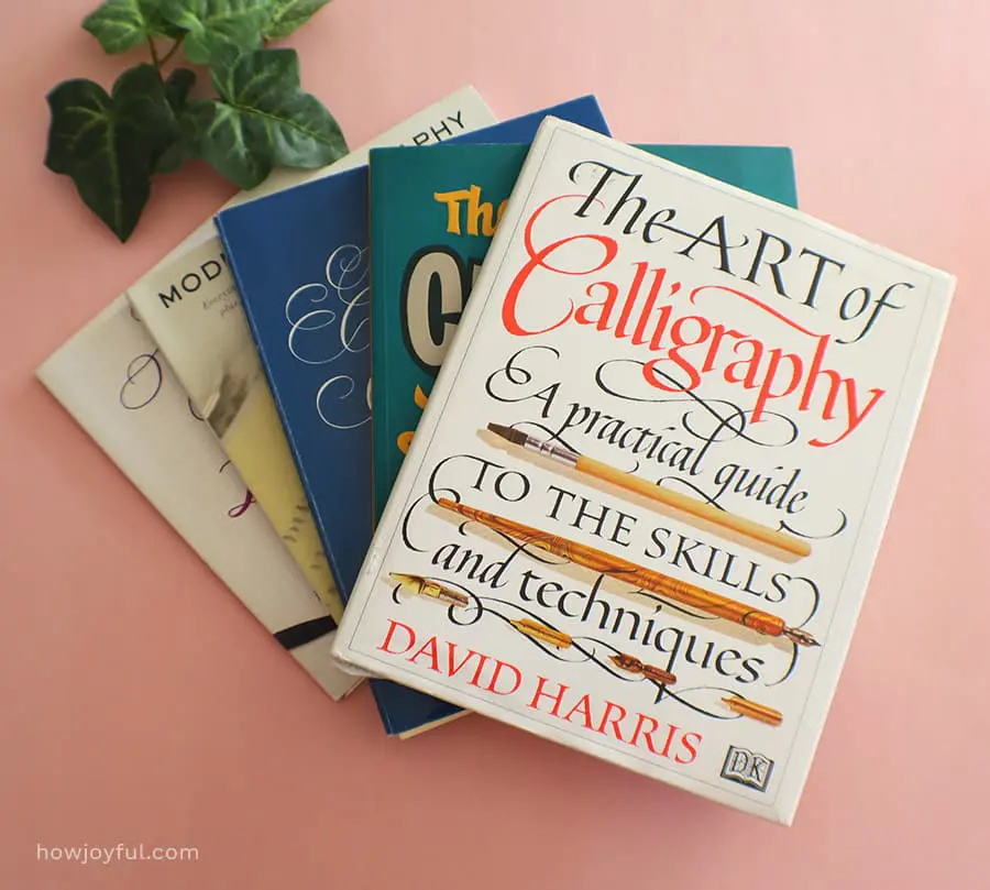

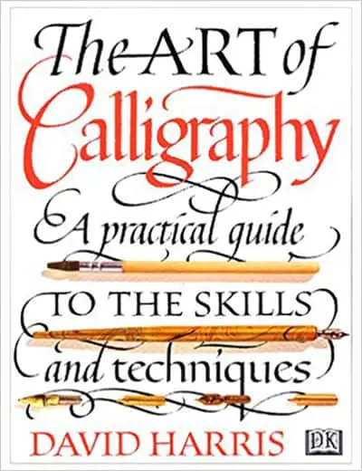


- 1 The Art of Calligraphy: A Practical Guide to the Skills and Techniques by David Harris: What I love about this book is that it gives you a fantastic historical background on Calligraphy and has step-by-step directions on how to construct classic calligraphy styles. If you are looking for a book to only learn how to do modern script brush calligraphy this might not be the one, BUT I believe is crucial to know the origins and all the classic calligraphy styles in order to really understand the calligraphy basics. So if you can grab a copy here and see more pictures of the book here.
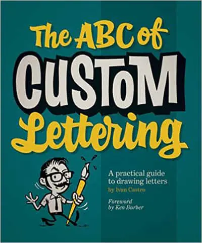
- 2The ABC of Custom Lettering: A Practical Guide to Drawing Letters by Ivan Castro: I don’t think I can recommend this book more, even though it is about lettering, Ivan does divide the book between calligraphy and lettering sections because it’s important for a lettering artist to understand the basics of calligraphy in order to know how letters are constructed. The calligraphy section is a great base for any beginner and since you will have the extra chapter in lettering, I believe this book is a wonderful purchase for any beginner, get your copy here and see additional pictures of the inside here.
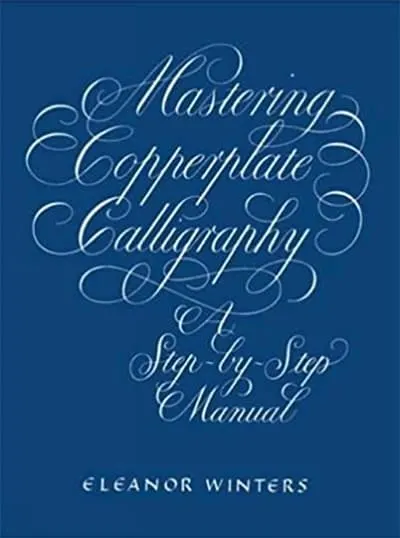
- 3Mastering Copperplate Calligraphy: A Step-by-Step Manual by Eleanor Winters: This is another book that is a great mix of instructions and history, you can find a detailed stroke by stroke construction for each letter and history of Copperplate. You can check out the book here.
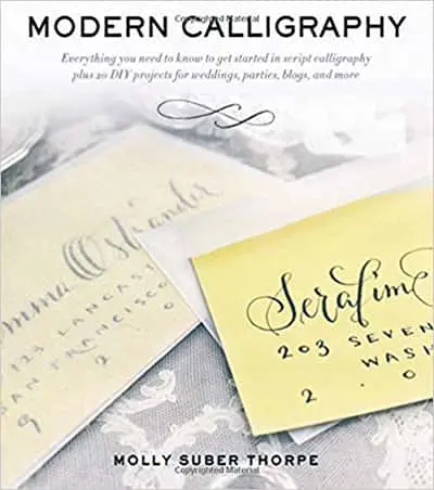
- 4Modern Calligraphy: Everything You Need to Know to Get Started in Script Calligraphy by Molly Suber Thorpe: While Molly is only covering pointed pen calligraphy in this book, I love the different projects she covers and most of it can be done with a brush pen instead. She also shares pages that you can trace (if you use tracing paper on top) and explanations about posture. You can get it here and see additional pictures of the inside here.
- 5Brush Pen Lettering: A Step-by-Step Workbook for Learning Decorative Scripts and Creating Inspired Styles by Grace Song: I really like how Grace goes over every basic stroke and explain position and supplies, however, she starts the book by giving the wrong explanation of what “Brush lettering” and “faux calligraphy” is and this can make it confusing for anyone just starting, as I explain in this post Lettering and calligraphy are not the same, and Faux-calligraphy is basically lettering. She also has a great section with projects and layouts examples and ideas. Check out the Kindle and paper version here.
IN-DEPTH POST: If you want to read more about the books mentioned above, you can find more about the best books for Lettering and Calligraphy in this post.
Modern Calligraphy Online classes
I am sharing some of my favorite places to learn, but if you want a detailed list of classes, check out this post with 25 calligraphy and lettering classes for beginners.
- 1Skillshare – They have a great mix of traditional calligraphy and also brush calligraphy. One of the best things about Skillshare is that since they have monthly and yearly subscriptions, you can take as many classes as you want all for the same fee. AND if you sign up with my link, you get 2 FREE MONTHS of Premium! So basically, you have 2 months to learn as much as you can for free, how cool is that? Check out their classes here.
- 2CreativeLive – The style of class that they have in CreativeLive, is more like a recorded workshop, and this can be weird for some people, but I love that you get “real live questions” answered in the spot and they have a great assortment of classes, they also have sales every few months, so subscribe to their newsletter if you want to get notifications. Check out the design/lettering classes here.
- 3Amanda Arneill – Not only Amanda is a great artist, but she is also a wonderful teacher, her classes are in the more premium spectrum, so you will probably have to save up for those, but the variety of her classes and the depth she goes into everyone is worth it! Check out her classes here.
- 4Every Tuesday – Teela is amazing, she has a bunch of free content in her YouTube channel and different price packages for most of her classes, she also has a good range of classes listed in Skillshare that you can check out for free after signing up with my link. She is the one that taught me how to make fonts with her “Lean font making class”, Checkout all of her classes here.
MORE POST: Are you looking for more information about creative classes? I have a post that covers 25 of the best lettering and calligraphy classes, and also a review here of creatives classes on Skillshare.
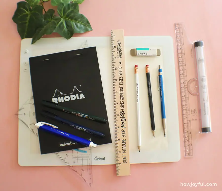
MODERN CALLIGRAPHY MATERIALS
Unlike with lettering where you only need paper, a pen, and an eraser to get started, for brush calligraphy you are going to need a tool that allows a variation in thickness when you apply pressure or rotation.
Many brush pens need a special paper in order to last longer or to perform better, so many times simple copy paper will hurt your pens (and your investment) more than purchasing a better paper.
So that is something to consider.
Since there are many alternatives out there for each material, the price ranges vary so much, I will cover options for most budgets and for beginner use.
The prices of the different items depend on quality, intended use, and longevity.
But if you are just starting, I always recommend selecting the budget-friendly options, because while tools can make writing easier, or be more comfortable, they are just tools.
What matters is how WE USE it and building muscle memory, an expensive pen will not make you write better than a less expensive option. But I do recommend trying a few different ones just so you can find the one that will make YOU the most comfortable.
a – Best brush pens for beginners
Brush pens are an essential part of brush calligraphy, we need a tool that will allow us to get different thickness depending on how much pressure we apply to the pen.


The main difference in pens are both the tip material and thickness, and we can classify them by soft or firm tip, and small and big. I personally think that a harder tip makes it easier when you are learning because you can control it better, but soft tips let you achieve thicker lines, and sometimes it is better to learn with the tool that is harder to control so that the no other pen can intimidate you.
But at the end of the day, it is a matter of preference if you are not sure, I would recommend you grab a soft and a firm brush pen, that way you can test to see what you are more comfortable with. I have a full post where I go into all the most important characteristics of brush pens here.
There are basically three different kinds of brush pen tips: synthetic hair, natural hair, and felt.
And for the most part, there are also two very distinctive sizes of brush pens, small and big tips. Based on my personal experience, I think that starting with the small tip ones was a lot easier, but if you like to start with a big challenge, going with the big ones will give you just that.

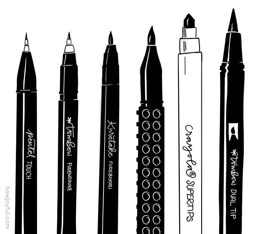
- Kuretake Fudebiyori brush pens: These are my current favorite brush pens, they have an easy-to-use felt tip and built-in ink supply combine the convenience of a regular maker with the expressive line variation of a traditional brush.
- Tombow brush pens: Tombow offers two of the most popular brush pens in the lettering community, the big tip Dual brush pens, and the small Fudenosuke brush pens, they have a wide range of colors for the Dual brush pens, and they continue to expand the range on their Fudenosuke line.
- Pentel brush pens: Pentel also offers some amazing brush pens, the also have a small tip version called Sign Pen Touch, Fude Brush Tip. You have to be careful when buying them though because they have a regular version that doesn't have a flexible tip that looks exactly the same! I am linking to the brush pens here. They also have one of the best quality bristle Art brush pens with pigment ink that is both water-resistant and fade-resistant, this one is a little harder for beginners because of how soft it is, but I love the textures that you can get with it, and they offer the black in this fancier barrel.
- Stained Fabric Sharpie brush pens: After testing these ones while looking to draw on different fabrics, I was pleasantly surprised by how soft, juicy, and overall pigmented they are. They grew on me and now they are my to-go brush pens for most projects, definitely, try them if you want to test a different “big” brush pen.
- Sharpie brush pens: This one is also a “big brush” and it can be more economical than the Tombow dual-brush, I love how juicy they are and how pigmented the ink is, but because of this they don't tend to last too long. I always recommend to use them with tracing paper so that you waste as least ink as possible, they also have them in a bunch of different colors.
- Crayola markers: I love how budget-friendly these markers are, they are perfect for drills and the tips are not too soft (sometimes you might need to reshape them though) but other than that are they are perfect, budget-friendly and they last a long time. If you are just starting and doing a lot of drills get a box of these ones, you can thank me later ;)


b – The best paper for brush calligraphy
The most important thing about the paper you select is that it needs to be smooth, no matter the tip of the brush pen you select, all of them will not just perform better but also last longer with a smooth paper.

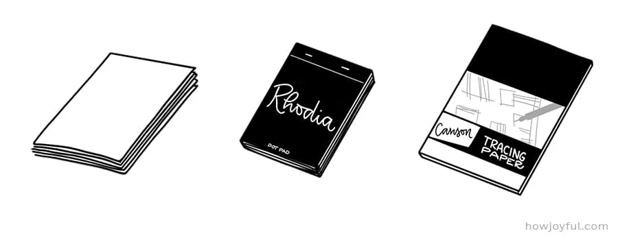
Using regular copy paper or anything with texture on it will damage and shorten the life of your brush pen, and we want those cuties to last us as long as possible!
My recommendations for practice paper (in no particular order) are:


- Rhodia pad: This little pad is the most recommended and loved paper-pad among lettering and calligraphy artist because of it's great smoothness. It comes in different sizes so you can use it for drills or just to create small pieces, it's more pricey than other pads, but it treats brush pens very well.
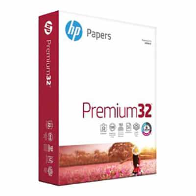
- HP Smooth Laserjet Paper: This is definitely the more economical alternative for paper, I use this exact paper to print all my drill grids. It's a great way to save money while you practice, so you can use your special paper for projects and your brush pens will not get damaged like they do with regular copy paper.
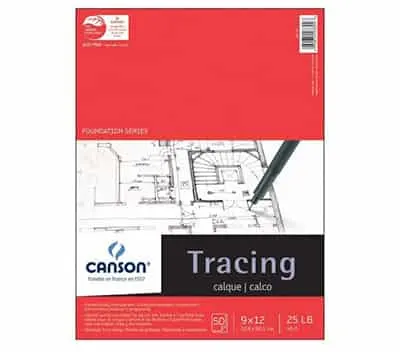
- Canson Tracing paper: This is my favorite paper for inking and also for brush calligraphy since it's super smooth and it does not absorb all the ink as some others do, but because of this you need to be careful and wait for the ink to dry, or you will have a mess in your hands and your paper!
- Canson Marker Pad: This pad is also a great alternative when using brush pens, it's definitely not as smooth as tracer paper, but it gets the job done and it's a lot thicker than regular paper so it will not bleed (or at least not as much) when using super juicy markers or brush pens.
c – Additional very useful tools for brush calligraphy
We talked about the two most important tools: brush pen and paper.
But when you want to work on composition, a pencil, eraser, sharpener, and ruler are a must.
You can use whatever you have around your house, or purchase a beginner lettering pack that will have almost all the tools you need, these packs below are my favorites, but you can get any brand you like.

One of the tools I love, but that is not 100% necessary at the beginning, is a light pad, I have both a regular light pad and the Cricut Brightpad. I use them almost every day when I am working on layouts, not at the same time, of course!
Ever since I got the first one I am converted, and if I am working on layouts without one, I feel like something is missing. I use it to work on changes layer by layer, and also to trace the final pieces.
I found it especially awesome when it comes to the use of watercolor. The fact that you can paint on top of a drawing without having pencil marks is amazing!
I will talk about my favorite one soon, and the reasons why I like one best than the other, but that is material for a whole new full post.
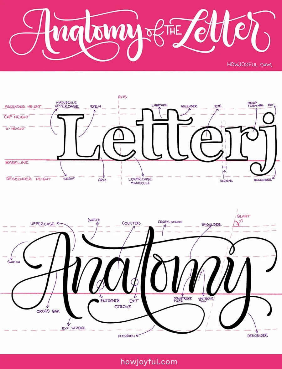
ANATOMY OF LETTERS
When you are starting with brush calligraphy, there are some terms that you need to know to understand better when other artists (and I in this guide) explain the motions.
Knowing the names of your reference lines (listed on the left) is a must, so start there first! You can then slowly get familiar with the rest (I didn’t list all of them, just the most important ones to get you started)
Letter anatomy explained:
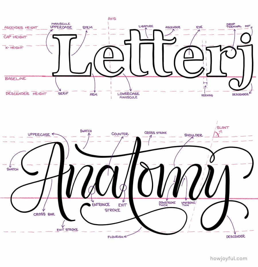
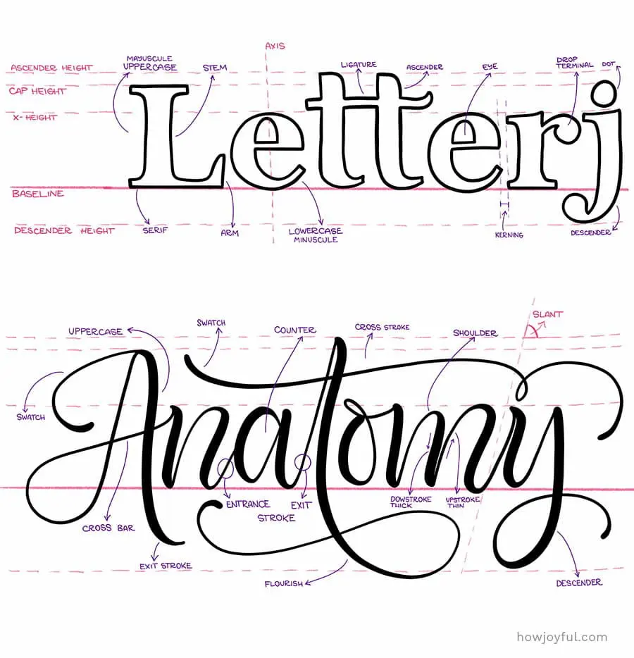
- Ascender: The upper part (above the waistline) of the minuscules b,d,f,h,k, and l.
- Ascender line: The guideline that defines the upper limit of all minuscules that have ascenders with loops.
- Baseline: Also called the writing line, is the base that defines the lower limit or where letters lay.
- Counter: The space inside a letter that is either part of fully enclosed by the thick and thin lines that define the form of a letter.
- Descender: The lower part (below the baseline) of the minuscule f,g,j,p,q, and y.
- Descender line: This line defines the lower limit of all the minuscule letters that have descenders with loops.
- Exit Stroke: The hairline stroke with Wichita most of the minuscules and many of the majuscule letters end.
- Thick: A heavy downstroke.
- Thin: A light upstroke, also called hairline.
- Lead-in stroke: Also called entrance stroke. Is the hairline stroke with which most letters begin.
- Letter slant, Axis: The degree to which the letters leans away from the horizontal or baseline. For letters to be parallel to each other, they all must have the same slant.
- X-height: Also called Waistline. It is the guideline that defines the upper limit of all minuscules that do not have ascenders.
- Ligature: A connecting stroke that joins two letters together in a word. They are sometimes called joins.
- Hairline: The finest line the pen can make.
- Mayuscules: A capital letter.
- Minuscules: A lowercase letter.
- Hand: Usually refers to the calligraphic style, like Copperplate hand, Italic hand, etc.
- Negative Space: Is the space around and between the letters.
- Interspace: The space between letters in a word.
THE OPTIMAL SET UP FOR MODERN CALLIGRAPHY
When you are starting is especially important to understand the factors that will influence the quality of your practice. Intentional practice is influenced not only by your mindset and your tools but also by what your body is doing, your surrounding, how your posture is, if you warm up and how you hold your pen to name a few.
So it's important to go over some of the most important ones, so we can make practice tie as productive as possible.
1 Posture
You want to pay close attention to how you are sitting, posture can help tremendously since we are not just moving our hand to make the strokes, we want the movement to come from our elbows.
Sitting up straight and having both feet on the floor is not only good for your back but also for an effective movement of your writing arm.
When you sit straight you are able to see what you are doing with your pen much better, since you have an overview instead of a tilted one. Additionally, when you sit straight you are less propensity to be off-balance and to lose control of your pen. And you will get tired not as fast as if you were sprawl over your paper.


2 Slant of surface
Many artists prefer to work on a slanted surface rather than on a flat table. To achieve this I use this over the table drawing table (that I painted white). But this is totally matters of personal preference, I know so many artists that are totally fine working on a flat surface.
This, just like with the kind of brush pens, I would recommend you to test, see what feels more comfortable, experiment. And if your posture is more comfortable with a slant, consider something like my little table. I consider this a good, middle of the road option, you can go as fancy or as simple as you want.
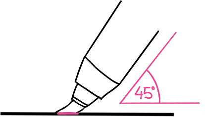
3 How to hold the pen
In order to achieve the most visual difference between the thick downstrokes and the thin upstrokes is to hold the brush pen at an angle of about 45 degrees relative to the paper.
The grip used to hold the brush pen is a personal preference, but in order to have the most control, you want your finger to be not too close to the tip of the brush pen, and also the hold not to be too far so that it makes applying down-pressure difficult.


Now, no matter the grip you use to hold the pen, you should always pay close attention to the angle you have in relation to the paper. If your grip forces you to hold your pen upright, you should correct it.
You should try to puck the barrel of the brush pen so it sits on the webbing between your thumb and your index finger. This will give you a greater angle and since your pen will be resting, it will be more comfortable to do a longer session.
While we could get super technical when it comes to holds, I instead want to focus on comfort. Because before starting to test crazy hand-holds for your brush pen, your hand should be comfortable, and gliding your pen should be a natural movement. Even when you are applying down pressure.
4 Speed
Speed is on the most important points that I often see artists not really talk about or give as much importance as it should. Control, especially on the upstrokes (to prevent them from being shaky) comes from going slow.
When you try the fragmented method of constructing letters, you do need fast strokes.
But for the fluid construction method (the one I teach) you will need to go SLOW, going slow will give you more control over your thin lines (or upstrokes), your downstrokes are by default a little more controlled because when you make a downstroke, you are using the whole surface of the pen as a support, so it is easier to have a good downstroke than it is to have a good upstroke.
So, upstrokes will be more challenging, but this is why we are using our whole body and our movements are not just on your hand but your full arm.
When we learn how to move our arm, going slow will not be an issue.
BUT this is something we need to practice in order to master because it is a movement that does not come naturally, as this is not how we normally write.
I am not going to lie, mastering your strokes is not easy, but once you learn to control them, forming letters will be a breeze! and graduating to flourishes will be a very natural progression.
5 Hand warmups
This might seem like a silly suggestion, but just like when we work out, we need to do warm-ups for our hands!
Warming up the muscles in our hands and arms will allow you to easily start practicing without the jitter and pain that can come from repetitive motions.
The warm-ups can be divided into two different sections:
a– Lifted warm-ups
These basically consist of motion that we should do with our hands in order to get our hand muscles looser. I like starting from my shoulders and work my way to my fringes.
Just like you would do when you warm up for exercising, the goal is to stretch and extend our joints so that our hands and arms perform the movements without getting tired or jittery.
We can do this by doing rotation movements, start with your arms, wrist, and fingers. Next, we want to make a strong fist and extent your hand open as strong as you can. So open and close your hands, do this a couple of times and you are ready to jump to the paper.
b– On paper warm-ups
As the name hints, these are drills that we can do on the paper to help our hands warm up. I always like to do half a page of these before I start a session as it makes me get confident on my upstrokes and makes them way less jittery than at the beginning if I haven’t warmed up.
BRUSH PEN PRESSURE BASICS
The number one trick to improving your letterforms when doing Brush calligraphy is mastering the pressure and angle of your brush pen.

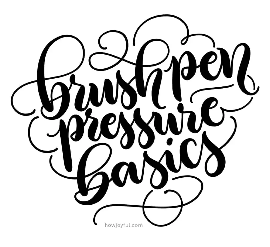
There are 3 different times when our movements and pressure will be different. And is normally referred to as the “Golden rule” – We put pressure when writing a stroke down, and we glide or put no pressure when going up.
But let's go into detail:
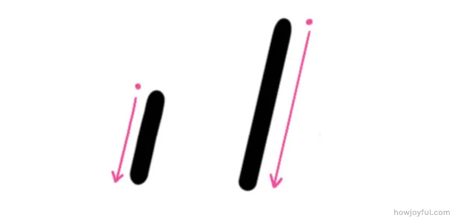
a – Upstroke
These are thin lines (colored blue in this guide), to achieve a thin line, you have to glide your pen, applying very light pressure (just enough for the tip to touch the paper), always holding your pen at a 45-degree angle from your paper. Thin lines are usually the hardest to master, because you will have less contact with the paper, but don’t worry, because it’s all about muscle memory, the more you practice your upstrokes, the better and less shaky they will be (Also not drinking coffee before practice will help)


b – Downstroke
These are thick lines, (colored in hot pink in this guide), to achieve thick lines you need to apply full pressure to your pen so that most of the tip of your brush touches the paper, always holding your pen at a 45-degree angle from your paper.
The problem most people have achieving thick lines is that they think that brush pens can break if you put too much pressure. BUT don’t worry about that! They are designed to handle that pressure; you will damage your brush pen when you use porous copy paper way more than any damage that can be caused by putting pressure on it.

c – Transition
These are the spots where you start lifting or start applying pressure (marked with dots in this guide) to go from a downstroke to an upstroke or vice versa. It’s essential to know where you need to start with your transitions because if you start too late or too early, you might have readability issues when you begin constructing letters.
INTRODUCTION TO THE BASIC STROKES
These 8 shapes are the foundation on which we will construct letters.
They are the pillars in which letters are built, and in order to make better letterforms, it is essential to master how to make the pieces that form each letter first, before we put everything together and create a letter.

And, the only way to learn them is by doing basic strokes drills; this repetitive motion will help us create muscle memory, this way our hands and eyes will get used to the movements and transitions.
What are the names of the basic strokes for brush calligraphy?
- Upstroke or entry stroke (thin hairline)
- Downstroke or full pressure stroke
- Overturn stroke
- Underturn stroke
- Compound curve
- Oval
- Descending stem-loop
- Ascending stem-loop
So now let's see them in action, all of them together and also one at a time with a detailed description of how to make each one. In all the graphics below I’ve marked with a single dot the beginning of each stroke.


1 UPSTROKE or ENTRY STROKE
This line can be a little deceiving because it seems so simple! Yet, can be hard to master because of the very light contact surface you will have. We use it at the beginning of each letterform and is the one that will connect one letter to the other.
To create this start where the single blue dot is placed; then glide the brush pen in an upwards movement applying as minimal pressure as possible so the brush pen will lightly touch the paper. We will go from the baseline to the x-height and stop.


2 DOWNSTROKE or FULL PRESSURE STROKE
While easier to achieve than the upstroke, the tricky part of the downstroke is that many beginners are scared to “break” their brush pens when they apply down-pressure. BUT brush pens are made to handle that pressure, so don’t be scared =]
To create this start where the single pink dot is placed, then apply full pressure maintaining a 45-degree angle in relation to the paper. Press as hard as you can and slide slowly down at the same time; this sheet is set up to practice long and short downstrokes.

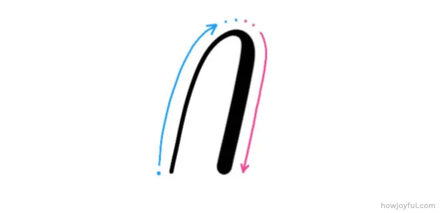
3 OVERTURN STROKE
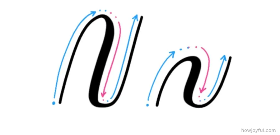
This troke can be found in the lowercase m and n. It is essentially a transitional connection between an upstroke and a downstroke giving it a “soft hill” look, this is the upside-down version of the under-turn.
To create this start where the single blue dot is placed, glide your pen, so it’s barely touching the paper without losing the line, and on the top start transitioning to a think downstroke, once you reach the pink section apply intense pressure maintaining a 45-degree angle.

4 UNDERTURN STROKE
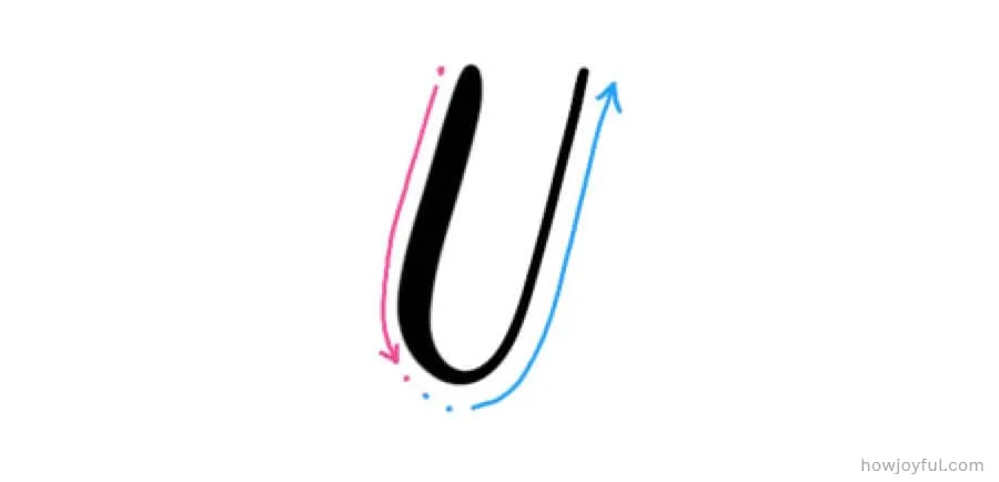
This stroke can be found in the lowercase a, u, i and w. It is essentially a transitional connection between a downstroke and an upstroke, giving it a U shape. You can also find an extended version of the under turn in the lowercase letter t and d.
To create this stroke start where the single pink dot is placed, apply firm down-pressure maintaining a 45-degree angle in relation to the paper on the downstroke and right before you turn, start transitioning into a thin and light line. For the upstroke glide the pen as soft and with very light pressure.

5 COMPOUND CURVE
This stroke, as the name hints, is the combination of an overturn stroke, followed by an under-turn stroke. It can be found in the lowercase h, m, n, v, x, and y.
To create this stroke start where the single blue dot is placed, glide with very light pressure in an upwards motion once on the top, start transitioning to a full downward pressure stroke, as you reach the bottom start transitioning gradually release the pressure and continue up with very light pressure until you reach the waistline.

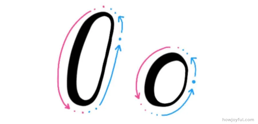
6 OVAL
This stroke can be found in lowercase o, a, d, g, and q. And while is very straight forward, this can be one of the trickiest strokes to be comfortable with, many times, I've seen students get super nervous about having to get back to the exact same spot we start from. But don't worry, depending on the letter you make, many times we can mask little issues in the closing spot with the stroke that comes after the oval when constructing a letter (unless we are making an o, of course)
To create this stroke start where the single blue dot is placed, around the 2 o’clock position. Glide your pen with very light pressure and begin slowly going counterclockwise, once you pass the waistline begin applying full pressure on s downward movement and around halfway between the waistline and baseline start transitioning so that when you hit the baseline, you already have a thin line, continue upwards with very light pressure until you close the oval.

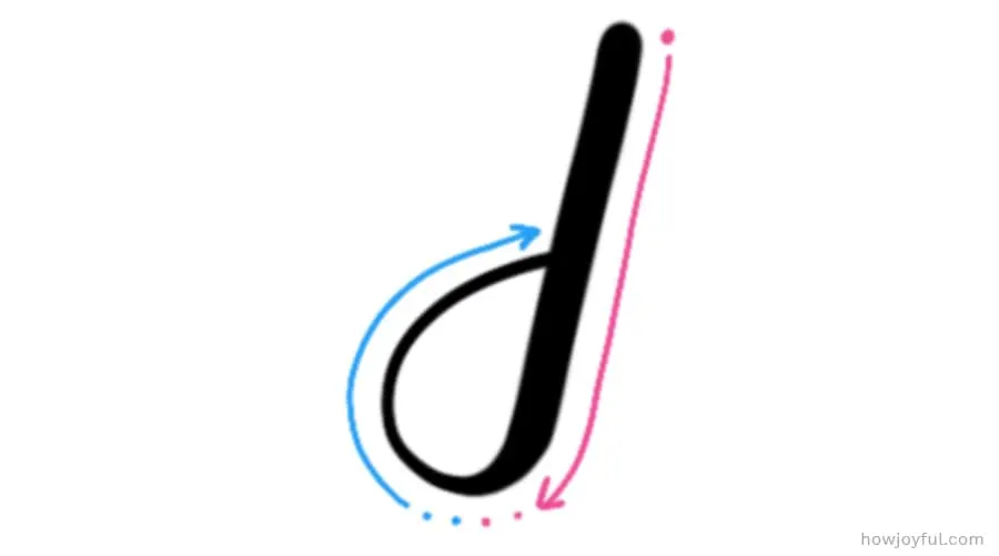
7 DESCENDING LOOP
This stroke can be found in the lowercase letter g, j, p, and y. It's the essential part of letters that go below the baseline. These lower strokes are the ones that we use to extend and play when we are adding flourishes since we can extend the stroke that crosses the downstroke.
To create this stroke start where the single pink dot is placed (right on the x-heigh), we go download with a full pressure stroke until right before we hit the descender line, where we start transitioning and lifting the pen and gliding our thin line clockwise in a circular motion to come back to the point where our downstroke touches the baseline.

8 ASCENDING LOOP
This stroke can be found in the lowercase letters b, d, f, h, k, and l. It's an essential part of letters that go above the x-height. Just like it's the counterpart (the descending stem-loop) we also use this stroke to extend when adding flourishes.
To create this stroke start where the single blue dot is placed, we start with an upward curved ascending thin stroke going counter-clockwise, right after we approach the ascender line we start transitioning and applying more pressure, then we continue until the baseline with a full pressure downstroke.


FREE MODERN BRUSH CALLIGRAPHY WORKSHEET
As we already went over, in order to create letters, first, we have to understand the basic strokes that construct letters, each one of these strokes is the foundation for the whole alphabet; these same strokes and some small variations of them.
This is why I believe the basic strokes are so important when starting with brush calligraphy. Because of this, I created a free set of worksheets that I compiled in a FREE printable workbook just for you.
All you have to do to get it is to subscribe to the newsletter above, and the worksheets will be automatically delivered to your inbox. (PS. If you are already a subscriber, you can also access these worksheets inside the Letter Vault.


USING THE BASIC STROKES
In order to create a letter, first, we have to understand the basic strokes that construct each letter on the alphabet.
Below you can see an example of how the full alphabet is constructed with each of the basic strokes.


And to explore each letter by strokes, below you can see the groups of letters that each of the strokes can construct.


Above I set up the letters from the easiest to hardest depending on what I've seen my students do.
The lower set of letters ( b, h, and y) seems to always be the ones that most struggle with the most. But don't worry! once you feel comfortable with the basic strokes, making letters will get so easy! – I promise!
And to help you understand letters a little better, we will separate them is 5 basic groups depending on the strokes that they have in common:
- Oval letters – o, c, e
- Straight letters – i, l, t, f
- Branching letters – n, m, h, b, p, k, r
- Diagonal letters – s, v, w, x, z
- Reverse Branching letters – u, y, a, d, g, q
CREATING WORDS – the 3 keys
After creating your first few words, you should so a happy dance and pat yourself in the back, because what you just did takes a lot of work!
But I also want to mention little details that you will start to see over time that will make your words THAT much better!
And we can break them down in 3 points:
1 Consistency
When we work with guidelines staying consistent is a lot easier because we have even lines that will let us know if we are starting to get our lines all over the place. So consider the guidelines kind of like training wheels at this point, yes, we could do without them and go back to fix things after the fact. But the best way to train our eye to see all these little details is by following guidelines.
2 Balance
(negative and positive space) For this example of balance, I am going to share an ornamented word, just because it’s easier to see the contrast in the examples when we talk balance means that we don't want our word or piece to have more “weight” in one side than the other, we want the visual weight to be distributed as evenly as possible.
3 Spacing
Just like consistency, balance is easy to spot when using guidelines. And its directly related to readability, when letters are too close together, or the spacing is too uneven, it is hard for our eye to understand the letter.

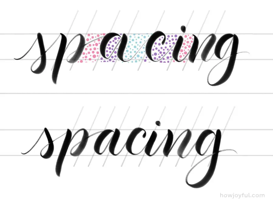
So when you see that your words are looking a little funky, it’s good to check all these points to make sure you are constructing legible, consistent, balanced, and evenly spaced pieces.
FREQUENTLY ASKED QUESTIONS
I've done my best to try and cover most of the questions I get in my workshops when it comes to learning below, but as usual, if you have a question that is not addressed, just contact me and I'll add it here =]
Is calligraphy easy to learn?
Yes, learning the basics is fairly easy, BUT getting good at it requires practice and lots of patience. You have to work on muscle memory by repetition so that the strokes and movements needed for each letter become a reflex. This is why doing drills is so important in order to improve, you need to practice where your thick and thin lines go when you create a letter.
Can calligraphy be self-taught?
Absolutely! But the speed at which you will get better directly depends on how intentional you are with your practice, so if you don't know what you are doing wrong, you can't improve. This is why I am sharing as much content as possible here, so you can have everything in one spot (worksheets included).
How can I be good at Calligraphy?
Practice, more practice, some extra practice, and PATIENCE. You do not get a flat tummy or a six-pack after spending 10 minutes at the GYM (it would be awesome if that were possible!). So just like you know that you have to put in the work to see results, you need to put in the work to get better at brush calligraphy. This is why drills are so important. And why setting time aside to practice is so important.
How do you write in Calligraphy?
The very basics of calligraphy are that you will use a tool that allows you to have differences in the width of strokes (this can be achieved by either a tool that changes with pressure or with angle), and using that tool, you will slowly write letters. With a brush pen, you will apply pressure when going down (downstroke) and lightly glide your pen when going up—no pressure (upstroke). This is called the golden rule, and it's the backbone of calligraphy. Master this rule, and you are halfway there!
How long does it take to learn calligraphy?
Exactly 23,4758 minutes!
Nah, I'm kidding! Just like anything new, learning calligraphy varies tremendously from person to person. It all depends on how much time you dedicate each day to practice, how consistent you are with practicing each day, and if you are considering all the factors that can make your practice better (positioning, tools, angles, grip, etc.)
What are the different types of calligraphy?
The most popular calligraphic style is Script (where all the letters are joined together), but this was not the first style to be developed; sans serif and serif styles of calligraphy were the first ones to historically emerge. For a small sample of historical alphabets, check this post and for a brief History of Calligraphy check this post.
What pens to use for calligraphy?
In order to write in calligraphy, you can use any pressure- or angle-sensitive tool. But some of the most popular tools are the dip-pen and brush pens. Brush calligraphy, or calligraphy done with a brush pen, is what I am all about in this blog, so I have an in-depth post all about brush pens.
Can you do calligraphy with a normal pen?
If your pen is soft enough so that when you apply pressure the line becomes thicker, yes, you can practice calligraphy with a regular pen or pencil. But if you are eager to learn just the construction of letters without having to worry about thick or thin lines to get started, I recommend you start with Cursive, I have a full guide for American Cursive here.
Can I make money with calligraphy?
Absolutely! I actually created a full post on how to make passive income for lettering artists, but on top of those revenue streams, you could also sell calligraphy services, like invitations, custom prints, or other products. Furthermore, if you plan to sell, you should be aware of the basics of copyright and trademark for artists so that you protect yourself and your work.
Looking for more letter-making goodness?
Take a look at these articles I wrote for you:
- Brush Calligraphy for Beginners Guide
- Calligraphy Alphabets: What are Letter Styles?
- The Difference Between Lettering & Calligraphy
- Typography Terminology Glossary
- The Best Brush Pens for Beginners
- 15 of the Best Books for Calligraphy & Lettering
- A Guide to American Cursive
- 25 of the Best Classes for Calligraphy & Lettering
- A Brief History of Calligraphy
- The Best Paper for Calligraphy
- How to Make Passive Income as a Lettering Artist


I hope you enjoyed this post! If you need any clarification don't hesitate to contact me!
Have a joyful day!
Bonnie
Thursday 18th of March 2021
This was so thorough and helpful. Thank you!
Joy Kelley
Saturday 20th of March 2021
I am so happy you liked it, and it was useful =] Have a wonderful day!
Maya kareem
Thursday 25th of February 2021
Thanks for sharing such a nice Blog.I like it.
Joy Kelley
Saturday 27th of February 2021
You are very welcome =]
sunil varma
Wednesday 4th of November 2020
Very useful and detailed information.
Emily
Wednesday 27th of May 2020
This is by far the best content I’ve come cross on brush calligraphy, thank you so much for sharing your knowledge for free. I am excited to subscribe to your blog.
Joy Kelley
Wednesday 27th of May 2020
I am so happy you found it useful Emily, and welcome to the subscriber tribe! =]