


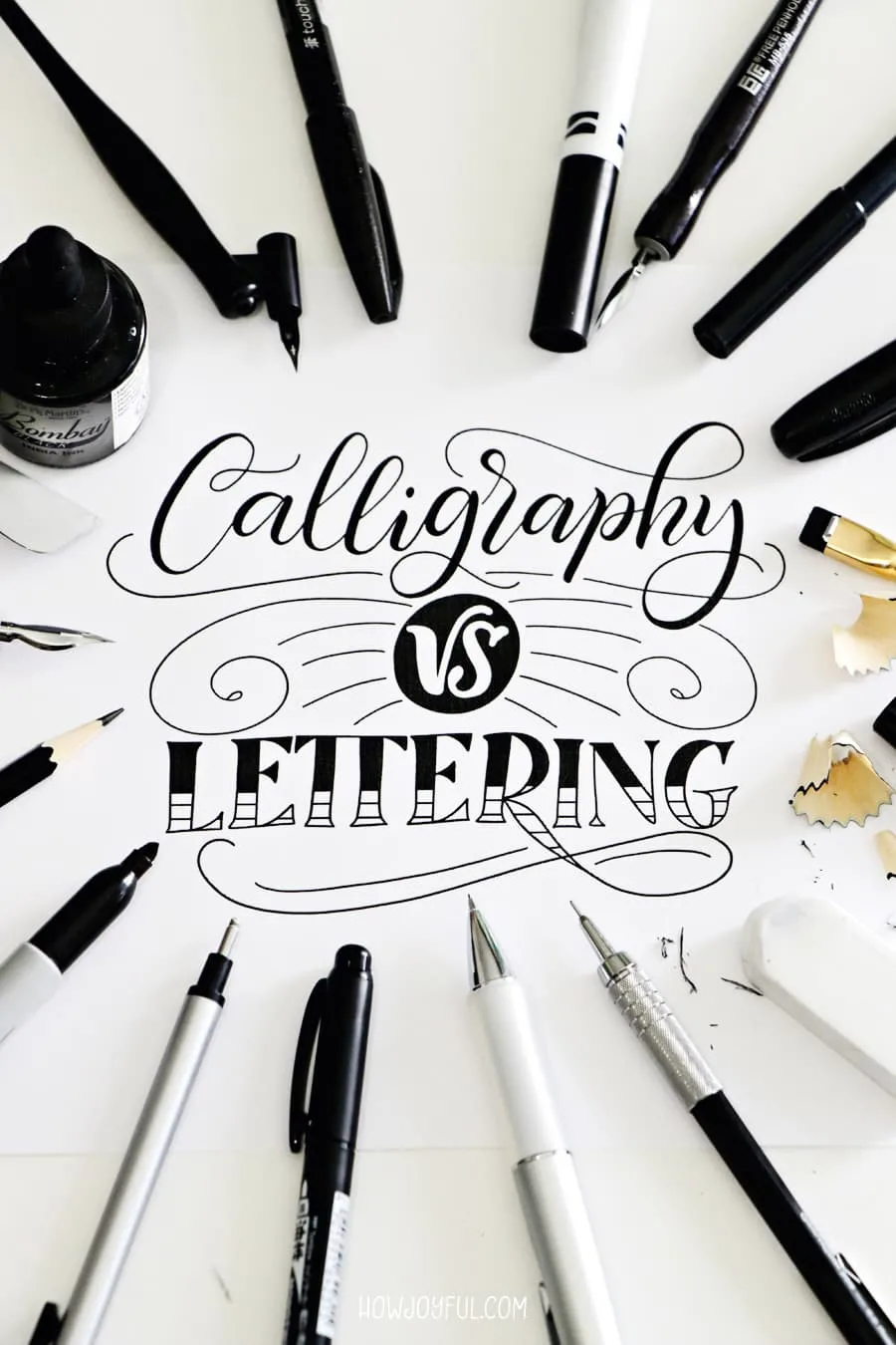
In today's post, we are going to dig deep into the meanings and differences between Calligraphy, Lettering, and Typography, so we can understand where they come from and why it is important to tell them apart.


Let's dig into the differences between hand lettering vs. calligraphy and typography, what each one of them is, and what makes them different.
I warn you; this one will be a long one! But bear with me, because I think this is the most BASIC thing we have to understand as beginners.
To start, I want to point out the main difference between calligraphy, lettering and typography. That is that calligraphy is the art of WRITING letters, Lettering is the art of DRAWING letters, and typography is the art of USING letters.
Since I would like to be as accurate as possible, we will examine each one and dig in books that will explain each term better to understand more of the nuances of each term.
One of the biggest misconceptions for people that are unfamiliar with design work is that calligraphy, lettering, and typography are interchangeable words, and while they are all art forms and they might be in related categories, they do NOT have the same meaning.
The world of letter-making is broken down into a few different categories of artists that are foundationally different: calligraphers, letterers, and type designers.
While letterers and calligraphers both create custom work involving letters, type designers construct systems of letters (known as typefaces) that work in endless combinations and output as ‘fonts' (read about the difference between typeface and font below).
- Calligraphy vs. Lettering
- Book references to each term
- CALLIGRAPHY DEFINITION
- LETTERING DEFINITION
- TYPOGRAPHY DEFINITION
- The difference between "font" and typeface?
- Common mistakes
- What is brush lettering?
- Why is it used incorrectly?
- What is brush calligraphy?
- What is faux calligraphy?
- What is chalk lettering?
- My letter story and mistakes
- Why write this post?
Throughout this process we will focus on the most significant difference between the 3, but first on calligraphy vs. lettering.

Calligraphy vs. Lettering
In a nutshell, calligraphers WRITE letters and letterers DRAW them; that is the essential difference between these art forms, but to really see the difference when we look at someone making letters, we need to dig to the bottom and address a few crucial points.
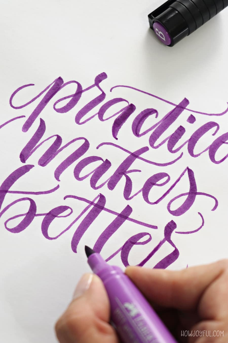
Most lettering artists start with calligraphy, because understanding how letters are constructed and behave, along with where the thick and thins are located, is an essential part of ANY work involving letters.


And while it is okay to only specialize in one of them, it can be harder to start making letters when the construction of each one doesn't make sense.
Most people only think of ‘script style' when referring to calligraphy, but there’s a significant number of styles that can be written in calligraphy that are not script style.
TIP: If you are interested in a good book with examples of different calligraphic styles, I recommend The Art of Calligraphy: A Practical Guide to the Skills and Techniques by David Harris. You can see additional pictures of all the recommended books in this post.


Book references to each term
I believe that the most accurate way to research the terms is by following the definition of the experts in the field; that is why I created a full section of references that we can study.
In calligraphy, the way we use a writing tool, with pressure differences in the motions as we ‘write' each of their parts, is what gives us the different thicknesses, no matter the style we are writing (sans serif, serif, copperplate, etc.)
On her book ‘Modern Calligraphy: Everything You Need to Know to Get Started in Script Calligraphy,' artist Molly Suber Thorpe explains:
“Historically, calligraphy was relatively inflexible, with classical styles taught as complete alphabets with established letterforms. The aim was uniformity, and practice was about striving towards the ‘correct”, predetermined shape.” but “twenty-first-century artists frequently create their own alphabets to reflect their personal aesthetics and personality.” – Molly Suber Thorpe, author of Modern Calligraphy
Now, what better way to dig deep than to read what other experts have to say about the differences between calligraphy and lettering.
The first reference can be found in the book ‘The ABC of custom lettering‘ by Spanish artist Ivan Castro. Castro separates his book in a “Calligraphy” and a “Lettering” chapter, to make sure we can identify them as something completely different.
He begins with calligraphy because that is the best way to understand letter construction. Like we mentioned above, in the ‘Drawing letters' chapter (aka Lettering), he states:
“In making the transition from writing letters to drawing them, we need to understand the differences between these forms. When we do calligraphy, our manual skill is very important, because we can’t correct what we have done, but when we draw letters, we do have the chance to correct, erase, ink over, criticize, erase, and draw again. It’s an entirely different method of working, even though the objective—making letters by hand—is the same.” – Ivan Castro, author of The ABC of custom lettering
The big takeaway from his words is that in lettering, we can correct and rework individual letters and compositions. While in calligraphy, you can also ‘plan' the artwork when making it.
You cannot correct or erase because most of the time, you are using ink with either a pointed/flat pen, brush pen, or any other specialty tool with ink.
Another reference extracted from her book ‘The Golden Secrets of lettering,' Argentinian artist Martina Flor defines:
“ Lettering refers to a unique personalized typographic expression, made for a certain application by combining shapes and graphic elements, in order to convey a certain attribute, message or idea.” – Martina Flor author of the golden secrets of lettering
I also wanted to add this quote by Vance Studley,
Calligraphy is a skill. This skill involves touch, pressure, hand movement, unity, and that elusive quality we term “beauty.” (Vance Studley, Left-Handed Calligraphy (NY: Dover, 1991), p. 8) found at Calligraphy-skills.com

Here you can see a graphic I made with the easier way to define each one
So now that we have a better understanding, let's define them:
CALLIGRAPHY DEFINITION
Writing letters, no matter the tools we use—dip pen, flat pen, brush marker, regular brush, etc.—we make a stroke for every essential part of the letter, sometimes a whole letter or word.
No matter the style—formal, classical, experimental, or modern—there is no erasing or correction of the letters. Calligraphy embraces the spontaneity of executing letterforms according to a model or freehand. Using muscle memory and repetition to execute set ‘styles' of letters.


“Kalli- is a Greek root meaning “beautiful,” and “beautiful” in the case of calligraphy means artistic, stylized, and elegant.” – Merriam Webster


LETTERING DEFINITION
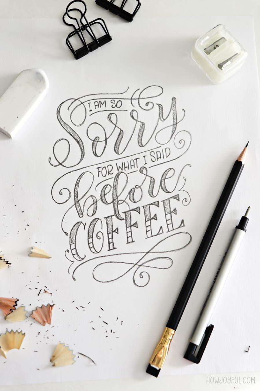
Drawing letters: in this case, we build the letters using as many strokes as necessary. We sketch, erase, correct, and add repeatedly until we are happy with the letterform and the connections between them.
In lettering, the relations of the letters are unique; we create one-of-a-kind letters and letter connections that are made (drawn, painted, carved) for a single artwork piece.


TYPOGRAPHY DEFINITION
Using pre-designed letters; is the art and technique of arranging type to make written language legible, readable, and appealing when displayed.
Generally, when we mention typography, we are referring to the use of letters created by type designers, and the arrangements of those letters that have been established by them. Type designers create systems of characters and make letters that work in endless combinations.

“In lettering, the letters are usually drawn, and for a specific context. In type, repeating letters typically have the same shapes. Fonts are capable of emulating the variation of lettering through alternates and ligatures, but they are still type: a system of pre-made letters that can be reproduced again and again.” – TypeNetwork
What is Type? Prefabricated letters that are made to be reused many times and in any order.
The difference between “font” and typeface?
I've seen more and more people reference different styles of lettering or even different styles of modern calligraphy as “fonts” and while if programmed, they COULD become a font.
Fonts are only a small portion of a typeface, so let's define them to see the difference.
Typeface: A family of fonts, usually with different weights and styles (bold, italic, thin, etc.)
Font: Is a specific weight or style of a typeface ( Helvetica Bold, Helvetica italic, etc.)
Common mistakes
A massive misconception in the beginner community is that the tool used to create the letters is what determines the name or family. (ex. Letters made with brush pens are ‘brush lettering', scripts created with pencils are ‘faux calligraphy')


Most people don't understand that Lettering and calligraphy are NOT defined by the tools we are using to create the letters, BUT by the method, we are using to construct them.
To reiterate the points we made above:
LETTERING: Drawing letters, using the necessary number of revisions, and modifications, and usually born out of several thumb sketch ideas.
CALLIGRAPHY: Writing letters, whether in one stroke or the deconstruction of several strokes, there is no erasing or re-adjusting.
I think the misconception comes because some people have only the pointed and flat pen associated with calligraphy, so when they see someone using a different tool, they automatically think that it has to be called differently (in this case, most times they use ‘lettering').


Now, it’s entirely possible to grab a soft carbon pencil and apply low and hard pressure to create thin and thick lines (the basic concept of calligraphy), but we are not going to call that ‘pencil lettering' because it was created with a pencil, right?
Another big misconception I would like to address before we keep moving is that to be a lettering artist, you HAVE to be a calligrapher and vise Versa.
Granted, while this is not true, it does help tremendously to understand and get better at both in order to be a well-rounded artist.


What is brush lettering?
Brush lettering, as it is popularly shared in social media, is not actually lettering (Like on the right side of my comparison picture above).
That would be considered Brush Calligraphy.
The actual origin of the term ‘Brush lettering' comes from the ’50s, and '60s when sign painting started as a profession in the USA.


The term was properly used then because, as the name implies, they were doing ‘lettering' using real brushes and paint, to paint signs.
With careful strokes, they would recreate their hand-drawn sketches on walls, windows, signs, or just any surface where their artwork was needed.


Sign painting is an art and trade that I admire so much, and even though the basics of lettering and letter constructions are the same. The final execution is mesmerizing to me.
A good short read is this post, “Brief history on sign painting‘.
And if you have an hour to spare, I highly recommend the ‘Sign painters‘ documentary; there’s something so awesome about seeing an artist emerge on a piece of work and share their passion for letters.
We definitely don't have enough of this kind of documentary for creatives.
“Featuring interviews with more than two dozen artists from across the United States, “Sign Painters” is the first film to explore the history of the time-honored craft of sign painting. Documenting these dedicated practitioners, their methods, and their appreciation for quality and craftsmanship, the film profiles sign painters young and old, revealing the growing renaissance in the trade.” – Sign painters documentary
The authors of the Sign Painters documentary, Faythe Levine and Sam Macon, also put together the Sign Painters book, which is full of greatness (it is not an instructional book, though).
Why is it used incorrectly?
Now that we understand the difference between Lettering and calligraphy, it is easier to recognize that the term ‘brush lettering' is used incorrectly on many occasions, and this is confusing for beginners!
I see so many people that think that they are learning ‘lettering,' but they are actually doing ‘calligraphy,' to be exact ‘Brush Calligraphy.'


What is brush calligraphy?
Calligraphy done with a brush is originally a traditional Chinese style (this is why many of the big brands of brush pens come from Japan and China).
The downside for Western calligraphers was that the use of those brushes would translate to bigger letters, and this made it hard to use on little details (envelopes, invitations, etc.)
So instead, Western calligraphy started to focus more on writing using pointed & flat pens (or dip nibs).
With the introduction of brush pens, especially fude pens with a small brush, it became super popular and easy to use them instead of pointed pens while learning calligraphy.
There is less prep work and limited nibs to clean and worry about storing.

Now we see people making calligraphy with a brush pen everywhere in social media, and many call it “brush lettering.”
But like we already covered, that is NOT the right term; if what they are doing is continual writing with no erasing, it would be BRUSH CALLIGRAPHY.


I know that I might sound a little passionate, and many people are going to roll their eyes because it’s just a word…right?
BRUSH CALLIGRAPHY instead of BRUSH LETTERING.
Well, in this case, that little word changes the whole meaning and the profession of the artist using it, so it is a BIG DEAL :D
Remember that we already talked about how not every letterer is a calligrapher and vice versa.
Just like photography and videography, they both use the same tools, but the results are entirely different.
They both have to master entirely different factors to create their end product. Sure, one of them will have an easier time transitioning from one to the other, but they use an entirely different setting in their tools and process.
In this case, it is the same.
What is faux calligraphy?
Now, with this term, I had a hard time, not only trying to pinpoint where it originated from but also understanding why people would even use it?
Now bear with me, I am talking from the perspective of learning lettering first. To me, it was so evident that what most people were showing, and calling ‘faux-calligraphy' was simply ‘lettering.'
So, maybe calling it faux calligraphy made sense to a calligrapher? Not sure.
Anyhow, no matter if it makes sense or not, there is no such thing as faux calligraphy.
When you make script letters by drawing a skeleton, adding weight with a pencil, and then filling in what looks like calligraphy, you are basically doing LETTERING.
That is the exact process lettering artists use to create their pieces.

If you recall the definition of both calligraphy and Lettering, you can clearly see that what we described is just lettering. We also covered the specific way we construct letters is what determines the difference.
Now, we could get super technical and have a passionate discussion over the way that some calligraphy pieces are created.
Because some calligraphy artists plan, trace, and correct before going to ink, maybe it would become something else, but the bottom line is that if the letter has been ‘drawn,' corrected, erased, drawn again, it’s lettering.
So, let’s ditch the ‘faux calligraphy' term, ok?
And since we are going over all terms, let's revise chalk lettering, too.
What is chalk lettering?
As the name implies, chalk lettering is when we create lettering pieces with Chalk.
Finally, this one is actually used correctly! And it’s easy to identify; when you are drawing with chalk, you just about follow the same techniques as you would lettering with conventional tools.
The only difference is that you might use shading and techniques that can only be obtained with chalk.


Granted, there are brush paints in different colors, or we could paint with regular paint on a chalkboard, and again we would migrate to an entirely different family because that would be more of a sign painting technique.
My letter story and mistakes
In my case, I started my journey with lettering while attending design school in Chile (I am an industrial designer by trade). I slowly ‘dipped' my toes into calligraphy (puns, anyone?). No, ok.


Because I didn't have a ‘proper' calligraphy background, I looked up to other artists practicing and sharing their calligraphy and lettering work.
I saw numerous artists creating letters with brush pens. They called it ‘brush lettering,' and since I figured it must be an English translation issue, I didn't question it!
But it made no sense because I knew the definition of lettering—I was so confused!
That is why I wanted to write about it, so hopefully, I will spare YOU the confusion, and we can learn the difference between calligraphy, lettering, and typography, so we can call what we are doing by their real name =]
Why write this post?
While we visited Chile this year, I was able to interview my Chilean lettering pal, Leo Calderon, and during that time we were capable of talking letters (video interview coming soon), and one of the things we talked about was how we both felt about the misused terms in the creative world.


That is why I want to start my lettering series from the ground up. It doesn't make sense if I start sharing lettering and calligraphy tips and tutorials without first covering the very foundation of terminology and letter construction.
And if I get one of you to start using the correct word, my mission will be accomplished =]
If you are still reading, THANK YOU!
I know this was a long one!
Want to save this post for later? Just pin any of the images below:


PS. If you guys have any specific topic or question, you would like me to cover for the upcoming post; just contact me!
Happy creating!
Andrea Wellman
Wednesday 23rd of December 2020
I read every word. :)
Thanks for such a through explanation. I'm hoping to start a blog soon, (I have been saying that for awhile stupid anxiety! Do you have any posts on how to start blogging? Like how to get over the nerves? But I'm rambling...) Anyway, I was trying to say, that I really liked the long form style more research based approach you took with the quotes and references in the post. It was a bold choice that paid off.
I realize this was 2 plus years ago, but hopefully it still gives you warm fuzzies to know your words still matter. They do!
Kaye
Thursday 27th of August 2020
This helped me a lot! Can a calligraphy not have thick and thin parts and still be called calligraphy? Kind of like those modern works that somehow resembled handwritings?
Joy Kelley
Friday 28th of August 2020
Hi Kaye!
I am so happy this helped you! Historically talking, a derivative from script Calligraphy that evolved to being done with monoline strokes is American Cursive, even though when done with a fountain pen, you can do thick and thins, when is taught in schools is normally monoline. While it's not Calligraphy directly, it is the closest derivative that I can think of that is normally done with monoline strokes.
I hope that helps! Joy -
jojo
Sunday 17th of May 2020
very useful article! I wondered what's the difference between 'hand lettering' and 'brush lettering', then I stumbled upon your article.
Joy Kelley
Sunday 24th of May 2020
I am so happy it was helpful to learn the differences Jojo =]
Cynthia
Thursday 23rd of January 2020
Very good blog post! I've been so confused and this perfectly explained the difference between lettering and calligraphy. I absolutely love this site. I will share this with my friends!
Joy Kelley
Thursday 23rd of January 2020
I am so glad this helped you Cynthia, and thank you for wanting to share the post! I appreciate it <3
Rosita
Monday 4th of June 2018
Thanks for the explanation, i was doing some research on the differences between Calligraphy and lettering. Your explanation really helps.
Joy
Wednesday 6th of June 2018
I am so happy it helped you Rosita! =]