


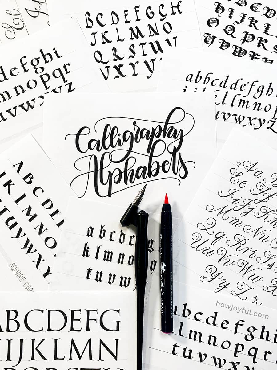
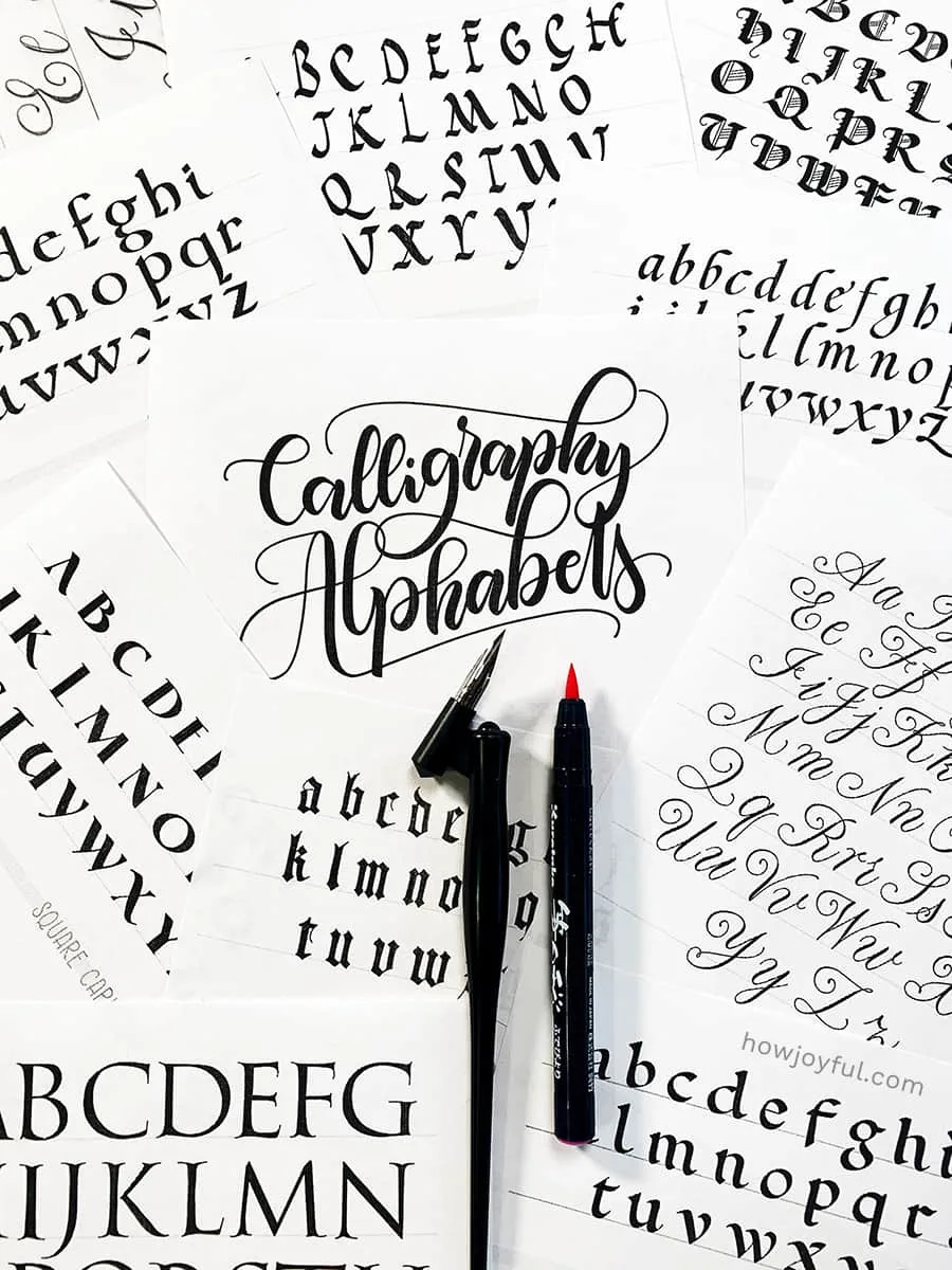
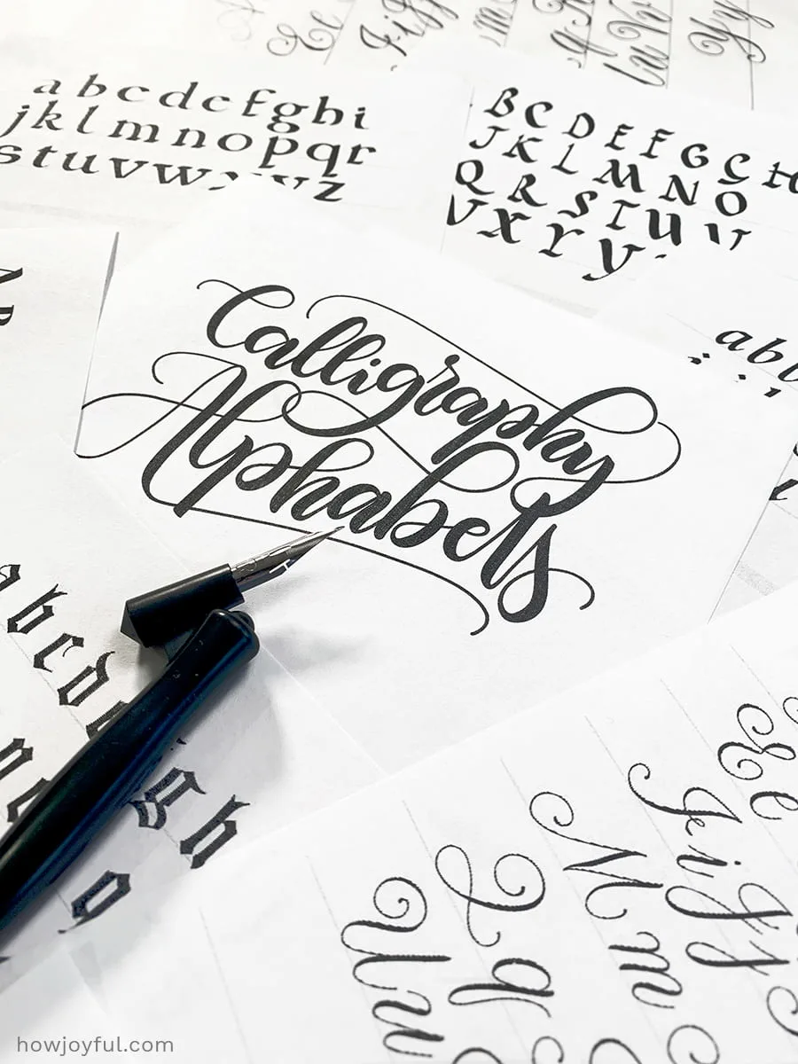
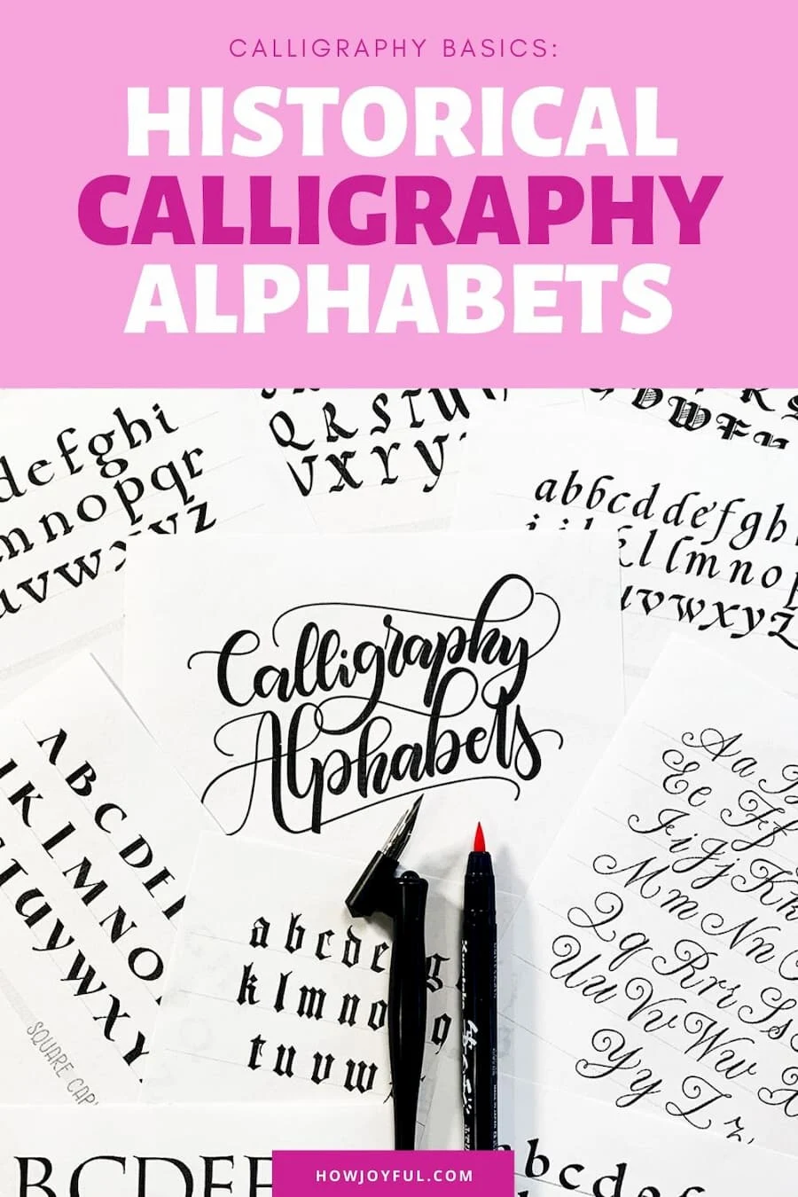
Calligraphy alphabets can be extremely helpful when starting our journey. They are the foundation that, after being studied, can help us develop our very own style. But sometimes the terminology, letter styles and families can be a bit difficult to understand, but don't worry! That's precisely what I'll be covering in this post!
For us to develop our own unique calligraphy alphabet, we need to first understand the different families and styles that are the staples and backbones of all letter constructions and alphabets.
There are almost infinite ways to make a variation of the 26 letters of the alphabet, some of them can be way more elaborate than others.
However, to create variations, develop your own style AND have your letters be both well-formed and legible, there are some parameters that need to be constant.
We also need to know the families each style originates from, so we can keep the identifying characteristics untouched for them to be recognized as the letters that they are.
All of this is what we will be revising in this post, and in the end, I am also sharing a FREE worksheet workbook with 30 different styles of calligraphy alphabets so you can download and start practicing right away!

I know we are all excited to learn about calligraphy alphabets, but to get there, we first need to understand the basic lettering families and styles.
And before we get there, we have to learn about the basics of the anatomy of letters and some other concepts that will be extremely useful as we submerge in this new art form.

IMPORTANT TERMS
As we go into the details of this post, it is important to differentiate the terms that many times beginners use interchangeably, but that are VERY different. I already went into detail on each difference in this post: The difference between lettering, Calligraphy, and Typography.
- CALLIGRAPHY: The art of writing letters. No matter the tools we use; dip pen, flat pen, brush marker, regular brush, etc., we make a stroke for every essential part of the letter, sometimes a whole letter or word.
- LETTERING: The art of drawing letters. In this case, we build the letters using as many strokes as necessary. We sketch, erase, correct, add, repeatedly until we are happy with the letterform and the connections between them.
- TYPOGRAPHY: The art of using pre-designed letters. We are referring to the use of letters created by type designers, and the arrangements of those letters that have been established by them.
- TYPEFACE: A family of fonts, usually with different weights and styles (bold, italic, thin, etc.)
- FONT: Is a single specific weight or style of a typeface ( Helvetica Bold, Helvetica italic, etc.)
- ALPHABET: Set of letters in a similar style that show all basic characters needed to create a font.
- HAND: When we go over the historical alphabets, we will reference each style like a hand.
- SCRIBES: They were the professionally trained (sometimes tied to religion) people that were responsible for transcribing, creating copies of books and some of the most skilled calligraphy masters.
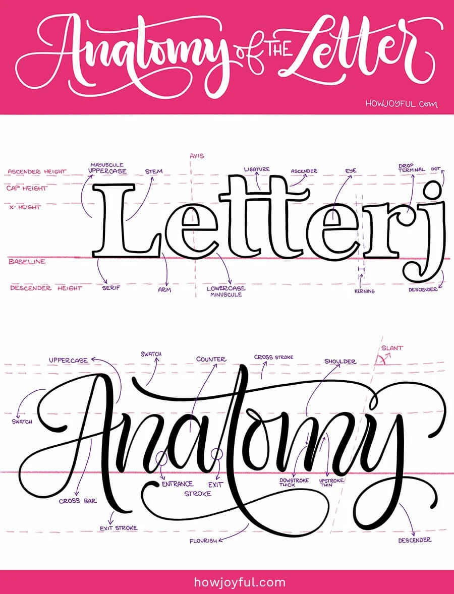
ANATOMY OF LETTERS
Letter anatomy explained, and some basic terminology to help us understand better:
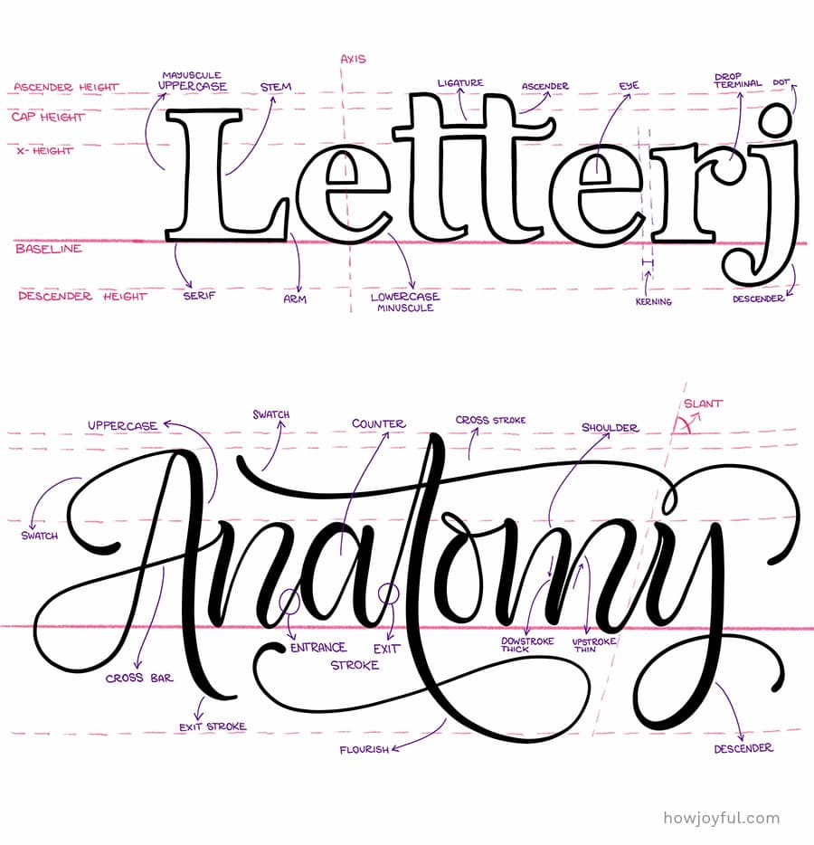
- Ascender: The upper part (above the waistline) of the minuscules b,d,f,h,k, and l.
- Ascender line: The guideline that defines the upper limit of all minuscules that have ascenders with loops.
- Baseline: Also called the writing line, is the base that defines the lower limit or where letters lay.
- Counter: The space inside a letter that is either part or fully enclosed by the thick and thin lines that define the form of a letter.
- Descender: The lower part (below the baseline) of the minuscule f,g,j,p,q, and y.
- Descender line: This line defines the lower limit of all the minuscule letters that have descenders with loops.
- Exit Stroke: The hairline stroke with Wichita most of the minuscules and many of the majuscule letters end.
- Thick: A heavy downstroke.
- Thin: A light upstroke, also called hairline.
- Lead-in stroke: Also called entrance stroke. It is the hairline stroke with which most letters begin.
- Letter slant, Axis: The degree to which the letters lean away from the horizontal or baseline. For letters to be parallel to each other, they all must have the same slant.
- X-height: Also called waistline. It is the guideline that defines the upper limit of all minuscules that do not have ascenders.
- Ligature: A connecting stroke that joins two letters together in a word. They are sometimes called joins.
- Hairline: The finest line the pen can make.
- Majuscules: A capital letter.
- Minuscules: A lowercase letter.
- Hand: Usually refers to the calligraphic style, like Copperplate hand, Italic hand, etc.
- Negative Space: Is the space around and between the letters.
- Interspace: The space between letters in a word.
FAMILY STYLES (classifications of type)
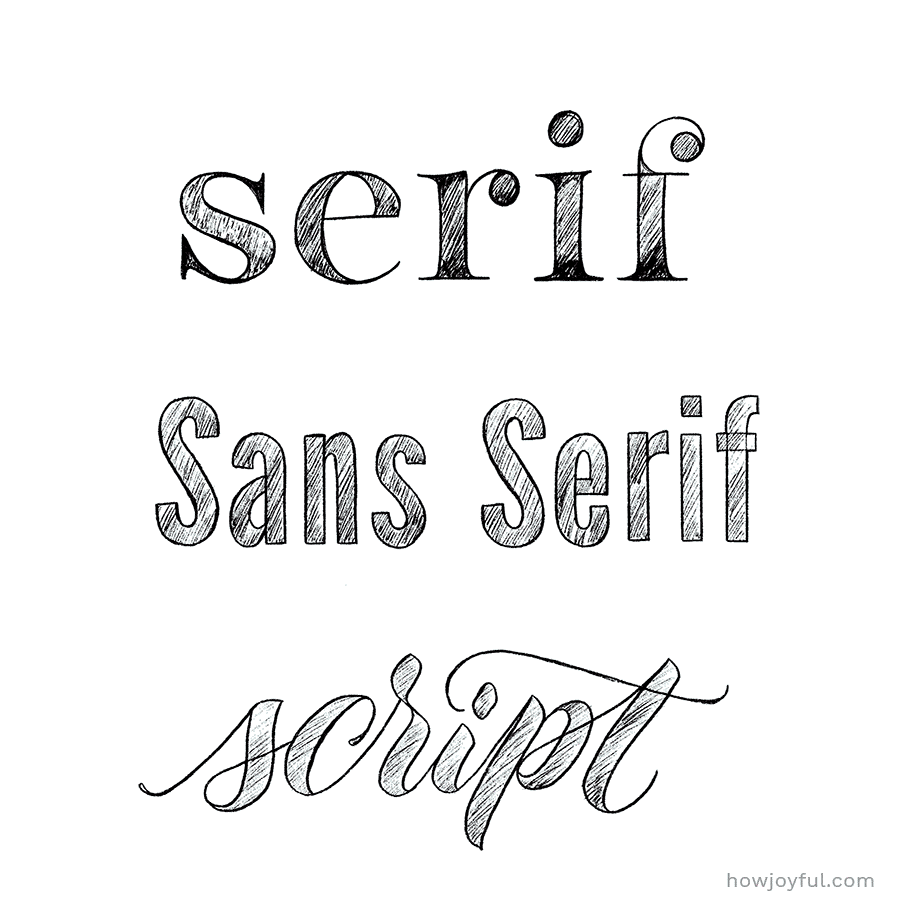
There are basically 3 families of letters, and all styles can fall under those umbrellas.
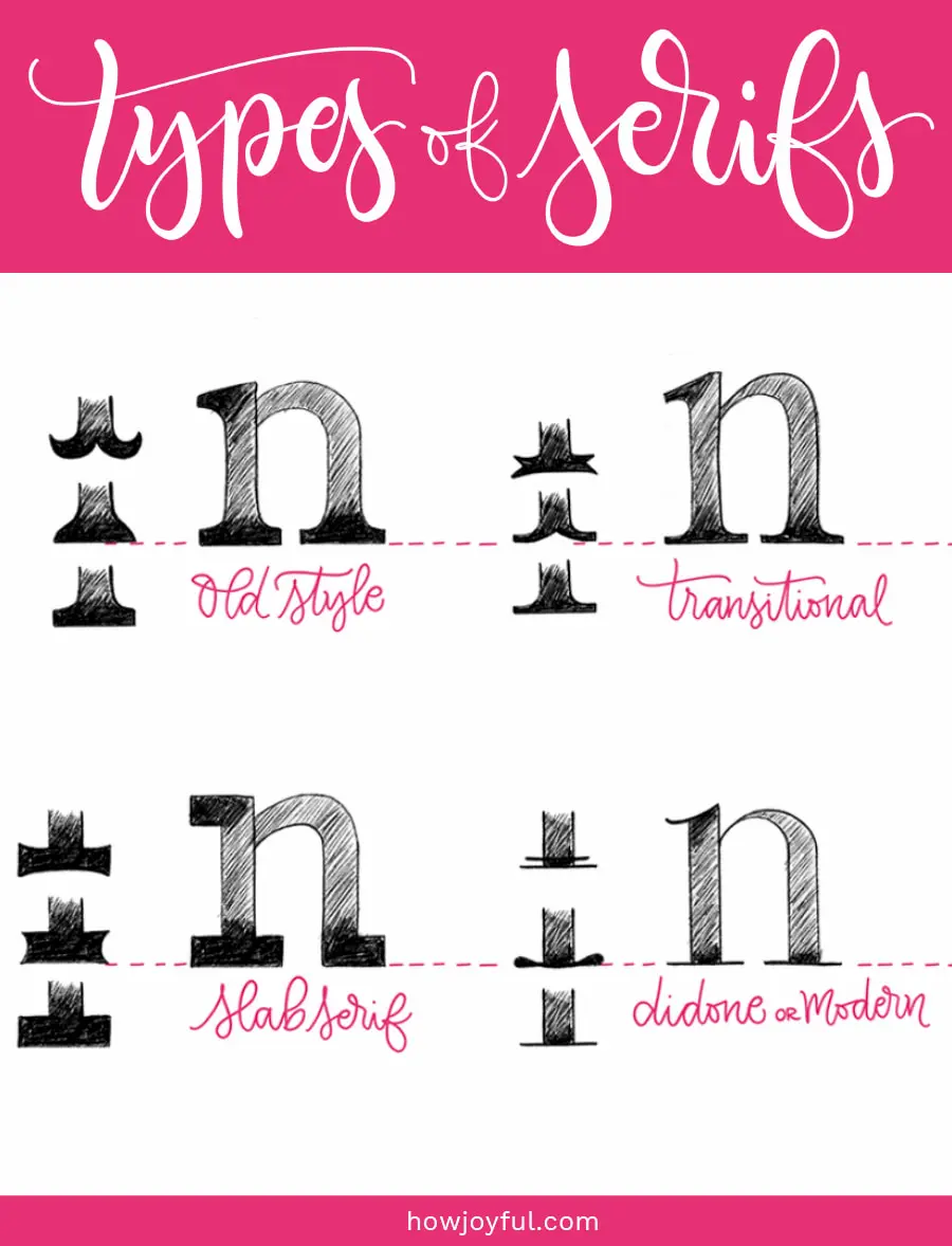
1 – SERIF
Visually, a serif is a terminal in the stroke of the letter. Now, the styles of serifs are just about endless, since we can all create our own styles of serifs, but no matter the embellishments we add, we can classify them in 4 groups that are easier to identify.

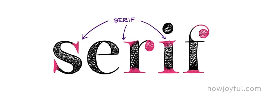

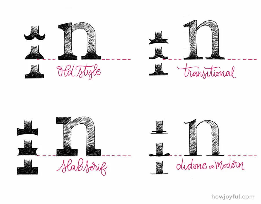
- OLD STYLE: The old-style serifs have their origin in broad-nib calligraphy. Old-style type is characterized by a lack of differences between thick and thin lines.
- TRANSITIONAL: As the name implies, it’s a transitional style in between “old style” and “modern”. It first became common around the mid-18th century until the start of the 19th century.
- DIDONE or MODERN: They first emerged in the late 18th century, are characterized by extreme contrast between thick and thin lines. Serifs tend to be very thin, and vertical lines very heavy.
- SLAB SERIF: Originally intended as attention-grabbing designs for posters, they have very thick serifs, with little difference between thin and thick. Often considered to be less readable than transitional or old-style serif typefaces.
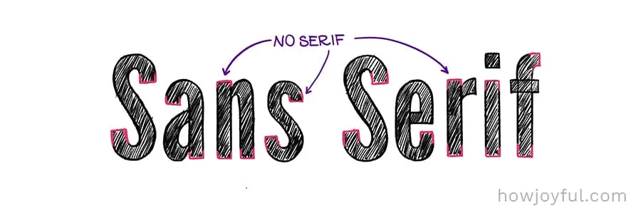
2 – SANS SERIF
It is the style in which letters do not have “serifs” (bottom or top bars attached to the letterforms) An easy way to remember is that the word “SANS” means without, so the name literally means “without serifs”. They are easily recognizable because of their clean profile.
Fonts in this family are most commonly used in web design as body text. If you are reading this blog post. The body text of my blog is set in a “sans serif” font, as it's one of the easier families to read when used in blocks of text for screens.

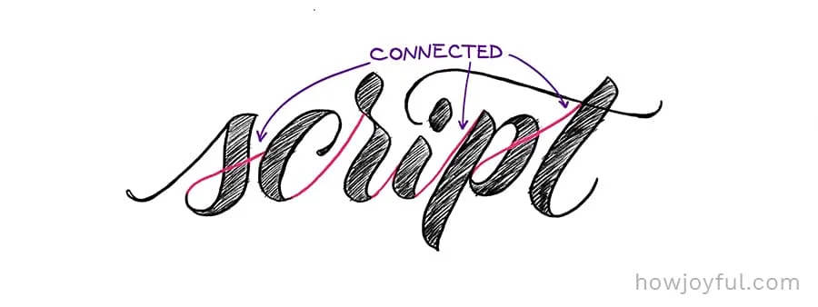
3 – SCRIPT
This (very popular) style, is characterized by the fluid way where most letters in a word are connected. It’s mostly used for display purposes, unlike serif and sans serif that are used for body text. Script styles are only recommended for titles, or to emphasize words or quotes.
It’s often used to add an edge or feminine touch (depending on the expressiveness of the strokes) to a full piece or a portion of a piece.

CREATING VARIATION IN LETTERS
There are several ways to create variation in letters (apart from styles) that will help us to create our own alphabets and styles. So let’s go over some of the most common and easy ways to add variation to your letters.
a – WEIGHT
The weight refers to the value of the stroke. And it also has a direct relationship to spacing because the thickness of the strokes affects the amount of white space within a letter and the relationship between the letters.

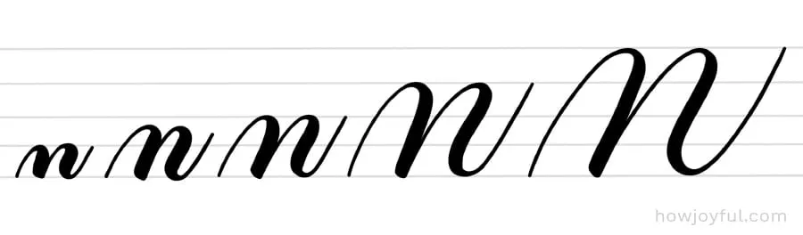
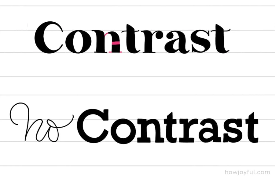
b – CONTRAST
Is the difference between the thinnest and the thickest part of the letter. In many examples of alphabets in script style, the contrast is very evident. The opposite would be to create letters with a monoline pen or sketching them having the same thickness.

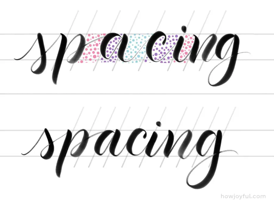
c – SPACING
Is the room between letters. Spacing allows us to identify where one letter ends, and the next one begins, but it also changes the perception of the work or letter when the space between them is different.

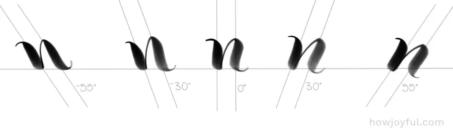
d – ANGLES or SLANT
The variation on the slant or angle is what can give letters inclination and sometimes a seance of speed. And while having different pieces with different slants can look beautiful, we should also avoid having more than one angle per line on a single piece.

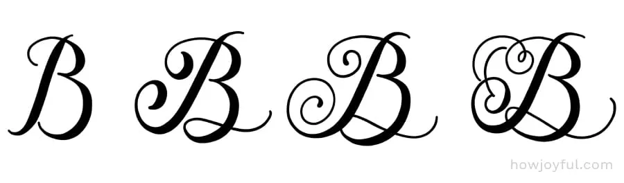
e – EMBELLISHMENTS
Adding different kinds of embellishments to letters, like flourishes, flowers, swashes, or curls and angles. Are the perfect way to make a unique set of letters to compose an alphabet. The possibilities are endless., but when adding embellishments, never lose sight of readability, sometimes we can have so much fun with the extras that the letter or letters could get buried in the noise.

HISTORICAL CALLIGRAPHY ALPHABETS
Now that we’ve gone over most of the important concepts that make letters change but still be legible. We should look into historical alphabets to get a more profound understanding of how they have evolved and some details we could grab from them.
This list includes only some of the most influential western calligraphy alphabets. If you are interested in the historical roots of Calligraphy, I wrote this post about the History of Calligraphy: Where does calligraphy come from.
I also want to point out that all the alphabets below were drawn and written by me. And, as many of you know, I am in no way an expert at those historical hands, but I used the book The Art of Calligraphy: A practical guide to the skills and techniques by David Harris.

If you are interested in learning more about the most significant historical events that led to the evolution of many of the hands listed below, then you should get this book. It’s wonderful! Did I mention that It also offers step-by-step instructions to learn and practice them? It’s so cool!
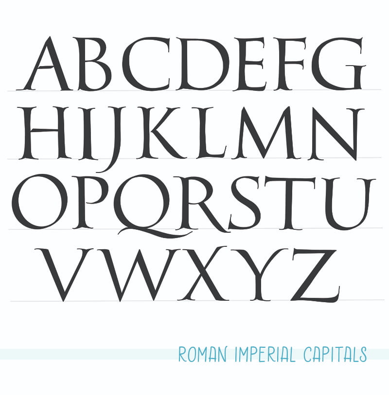
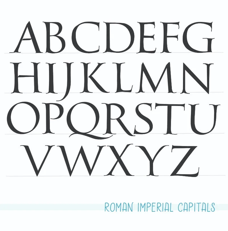
1 Imperial Capitals
(Capitalis Monumentalis) Used in stone cut forms on great monuments of Ancient Rome. The oldest examples of Imperial letters date back to the first century BC. This was the most complex (to draw) of the first hands Because of the different strokes needed to create these letters with a brush.
Capital letter with serifs had been written by the Greeks, but it wasn’t until the Romans developed a broad-edge brush that it became technically possible to write them quickly and with precision.
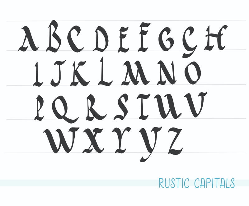
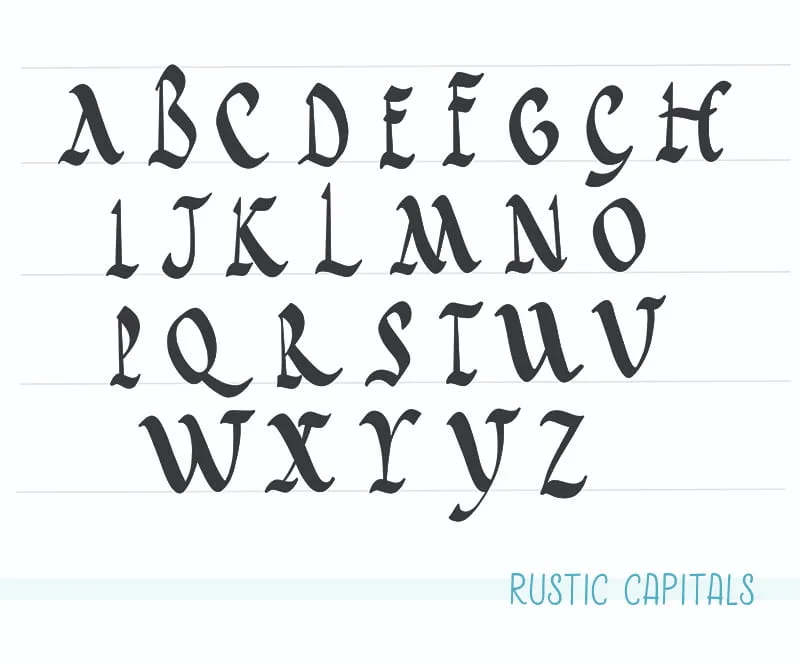
2 Rustic Capitals
Used from the first to the fifth century. This was an elegant alternative to the Imperial Capitals, after the fifth century, it lost the favor as a manuscript hand even though it was continually used for tittles for centuries afterward.
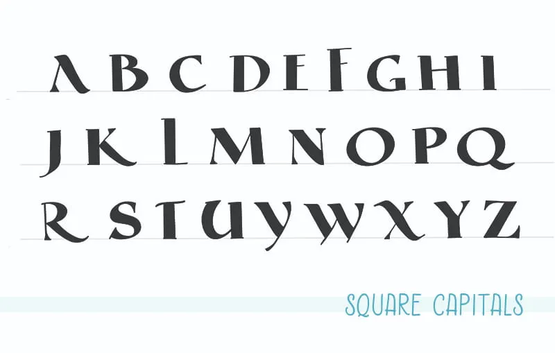
3 Square Capitals
(Capitalis Quadrata) This late fourth-century Roman hand, it's believed that it originated as an attempt to interpret the Roman Imperial Capitals that were brush-drawn and moved to a pen-dawn form. But the thick downstroke and hairline horizontal point to the use of a horizontal help pen, in contrary of the 30 degrees necessary to produce the Imperial Capitals. This makes historians believe that it might have been inspired by more contemporary wood carvings.

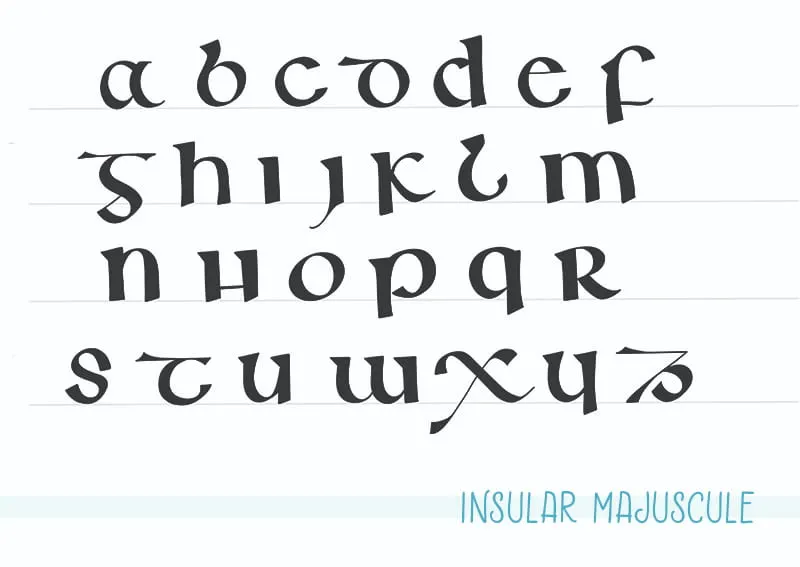
4 Insular Majuscule
The Insular had got its name from the Island of Britain and Ireland. As a prestigious hand, Insular is characterized by letters that are written slowly and carefully with many lifts of the pen. It is said that two of the most beautiful books ever produced during Medieval times (The Book of Kells & the Lindisfarne) were written in this hand.

5 Caroline Minuscule
This hand (Carolingian Minuscule) was developed in the eight-century as a reformed version of the Half Uncial. It survived until the Eleventh century before evolving into the Early Gothic and Rotunda.


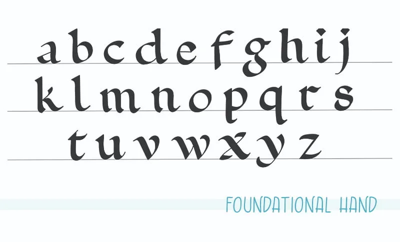
6 Foundational hand
This hand was developed by Edward Johnson. Historically, it belongs in the early 20th century, however, the basis for the script is a manuscript dating from the year 966 called the Ramsey Psalter. Believed to be produced by scribes at Winchester.

7 Textura Quadrata
Around the 13th century, the Early Gothic hand evolved into the Textura Quadrata hand. Its name indicates the “textural” visual effect that letters have when written. It was a revolution at the time, since readability had always been an emphasis when writing. And now most letters would blend into this visual texture.

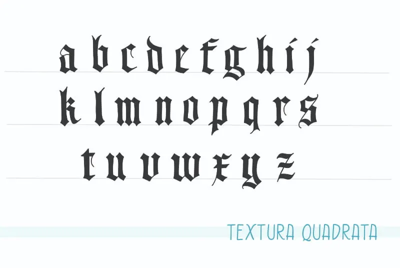
Take a look at the video demonstration below of the word “Equinox” by calligraphy artist Tri Le @tri.shiba via IG
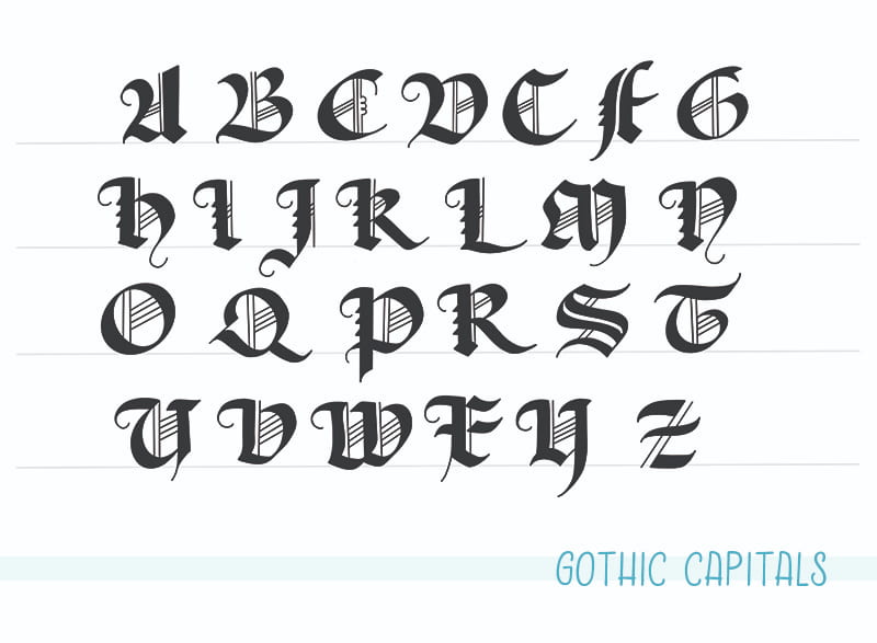
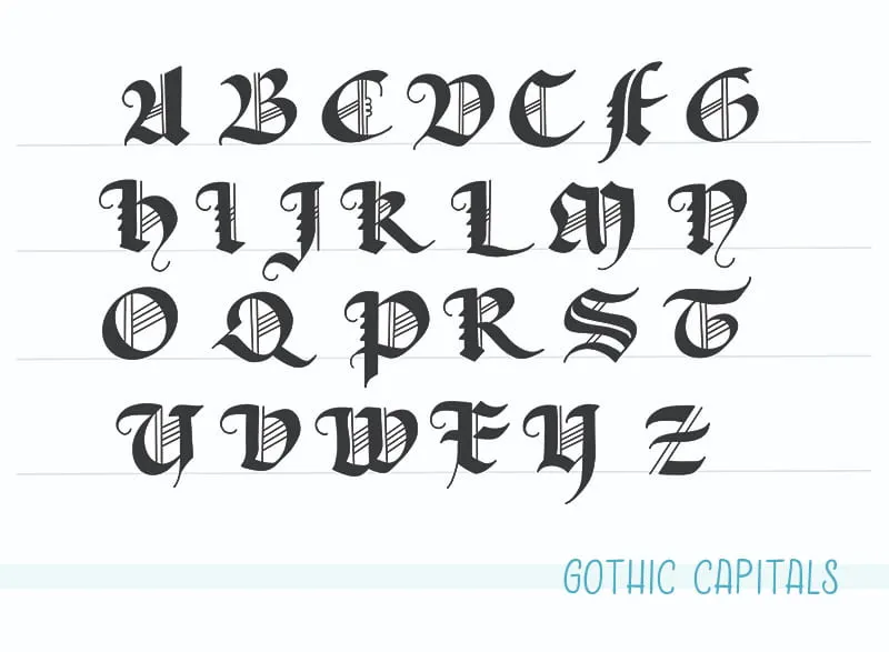
8 Gothic Capitals
It was in Gothic, where for the first time Capitals and Minuscules appeared together. As we now use Capitals to start a sentence. The Gothic hand is recognizable for exuberant flourishes complemented by hairlines inside the letter.
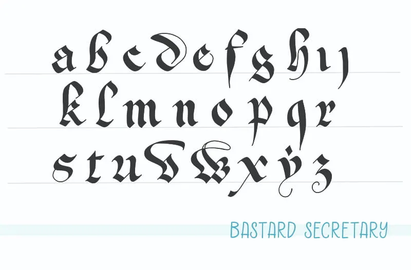
9 Bastard Secretary
As the more formal a manuscript hand became, the need for a functional cursive script for everyday things arose. A series of complementary cursive hands developed into full hands classified under the generic title of “Bastard” or Batarda scripts, denoting a mix of cursive and Textura.

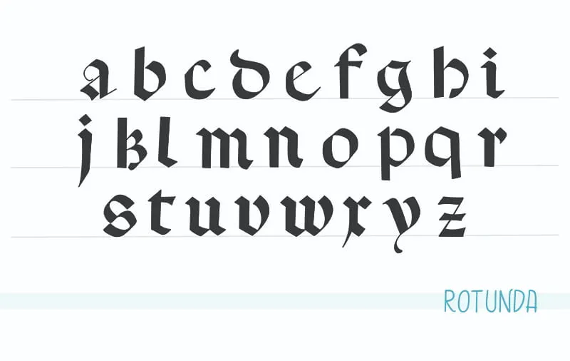
10 Rotunda
This hand developed around the 12th Century as the evolution of the Caroline Minuscule, with shorter ascenders and descenders. The Rotunda was a bolder hand, with a more clear and legible feel. It thrived in this form until the 18th Century.

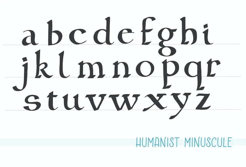
11 Humanist Minuscule
The Humanist minuscule (Littera Antiqua) is a direct descendant from the Caroline Minuscule. The letters are clearly defined and open. This hand, along with the Roman Imperial Capitals, are the most influential hands in our modern society.

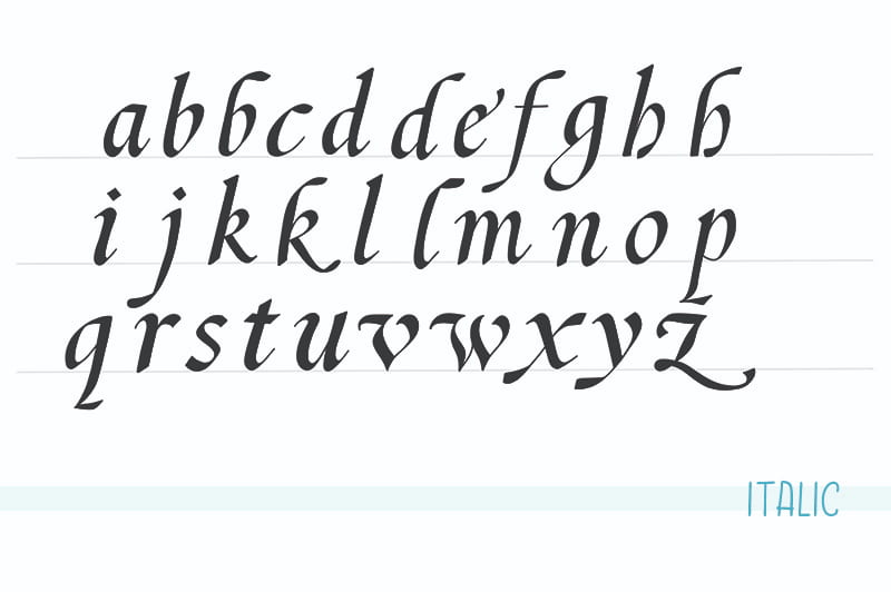
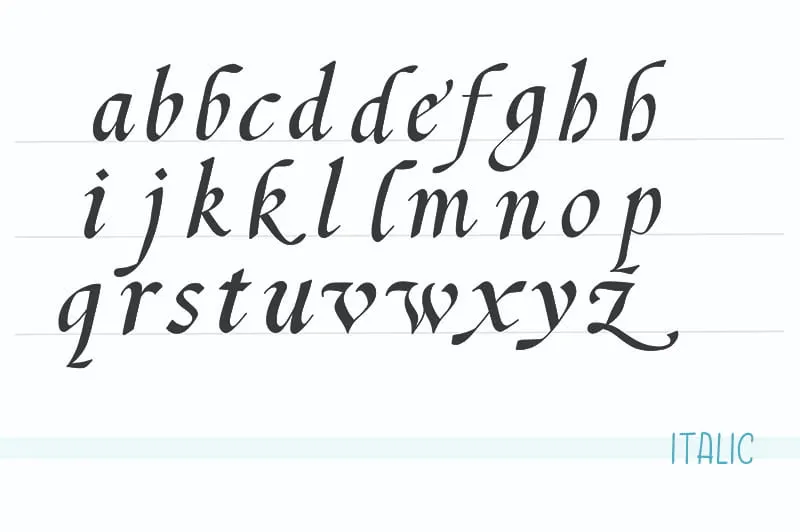
12 Italic
This hand was invented by Niccolò Nicooli in 1420. On it's the basic form, it’s a cursive offspring of the Humanist Minuscule. Over time, it became a distinctive hand in his own right, evolving later into what would be the Copperplate hand. The Italic hand is written with a slanted pen held at a 35 to 45-degree angle.
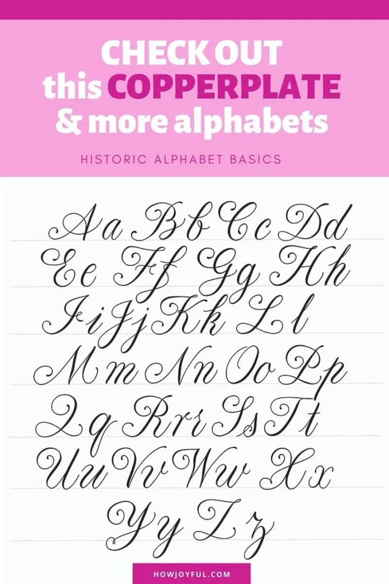
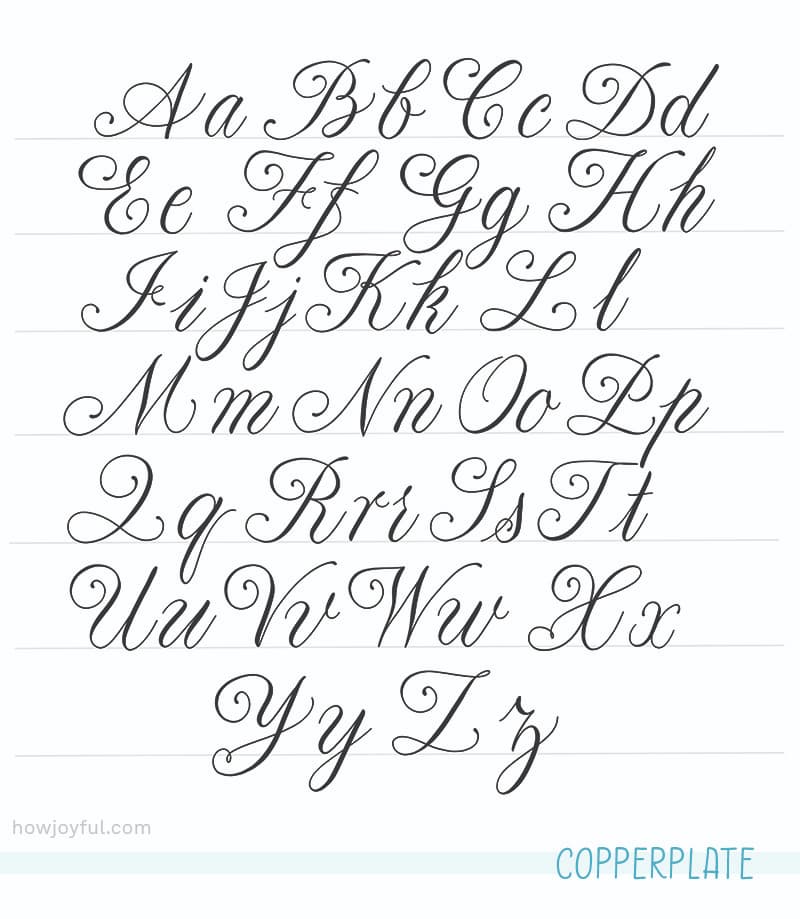
13 Copperplate
The mayor innovation on this hand is that, for the first time, all letters in a work are connected, making it especially fast, convenient and practical to write. By the mid-18th century, Copperplate was an established hand in commerce in Europe.
This hand, it's the one that has inspired most of the Modern Calligraphy work that we currently see, and while it's a traditional style, most modern artists have used it as a reference or starting point for their personal styles. Me included!
CALLIGRAPHY ALPHABET EXAMPLES
Now that we have gone through some of the most important calligraphy alphabets, or “hands” I also wanted to take some time to talk about personal style.
Twenty-first-century calligraphers frequently create their own alphabets to reflect their personal aesthetics and personalities, using daring layouts and innovative materials, seeking inspiration in everything around them.
With Modern Calligraphy, the notion that there is a right and wrong way to write letterforms seems outdated. But as we explore this time of celebration of self-expression in our letters, we still have to be careful to maintain legibility and not have our letters be lost in embellishments. Because the most essential aspect of letterforms is to deliver a message.
One of the best ways to check out new alphabets is to look into different typefaces, where we like a specific font and explore learning from it.
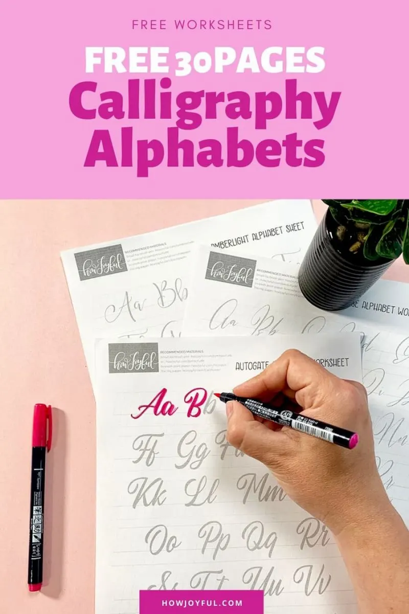
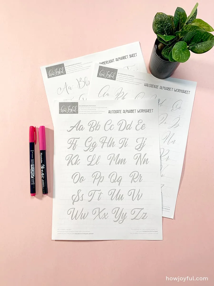
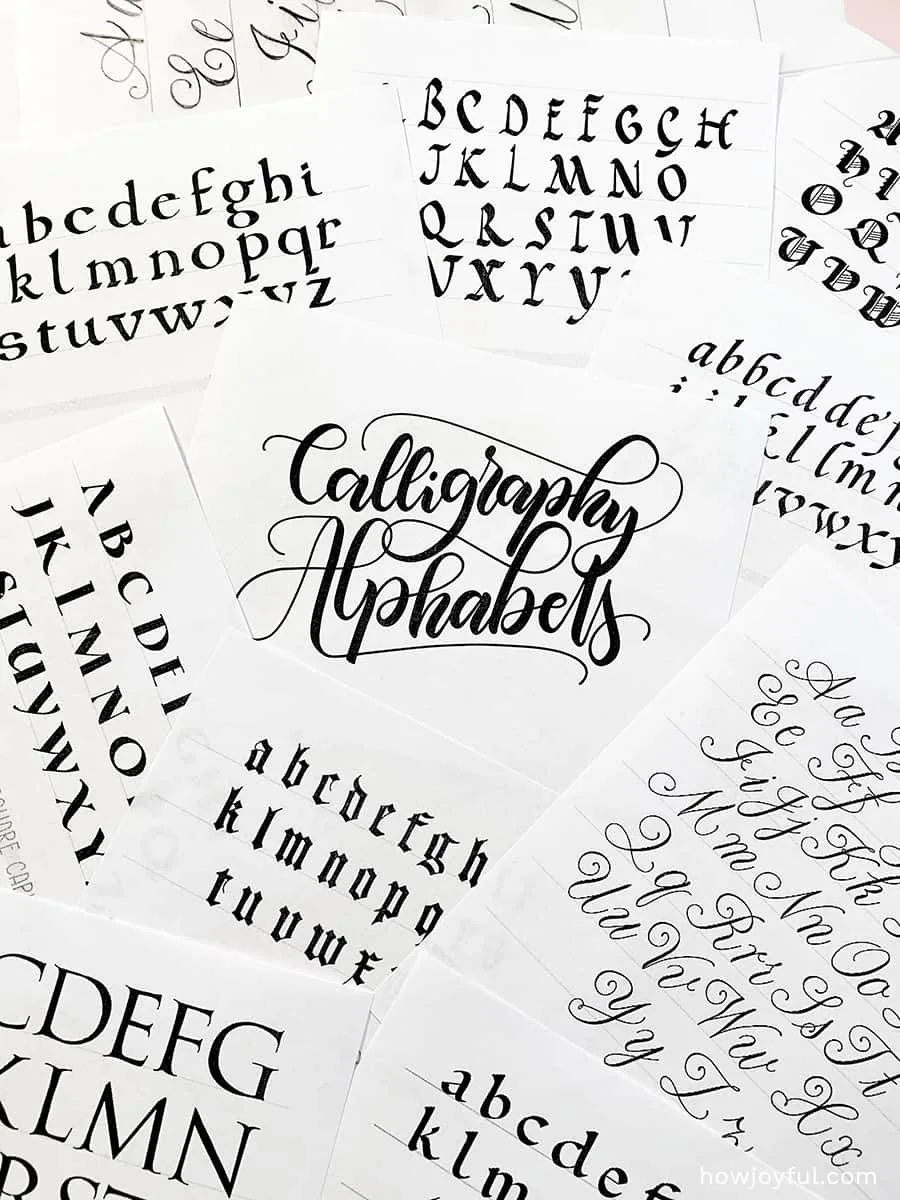
This is why I wanted to share some of my favorite font-based alphabets. And to help you practice better, I included all the ones listed below and some extra ones in a FREE 30-page calligraphy worksheet that you can get at the bottom of this post!

But let’s check some of my favorites of the different lettering styles included in the worksheets:
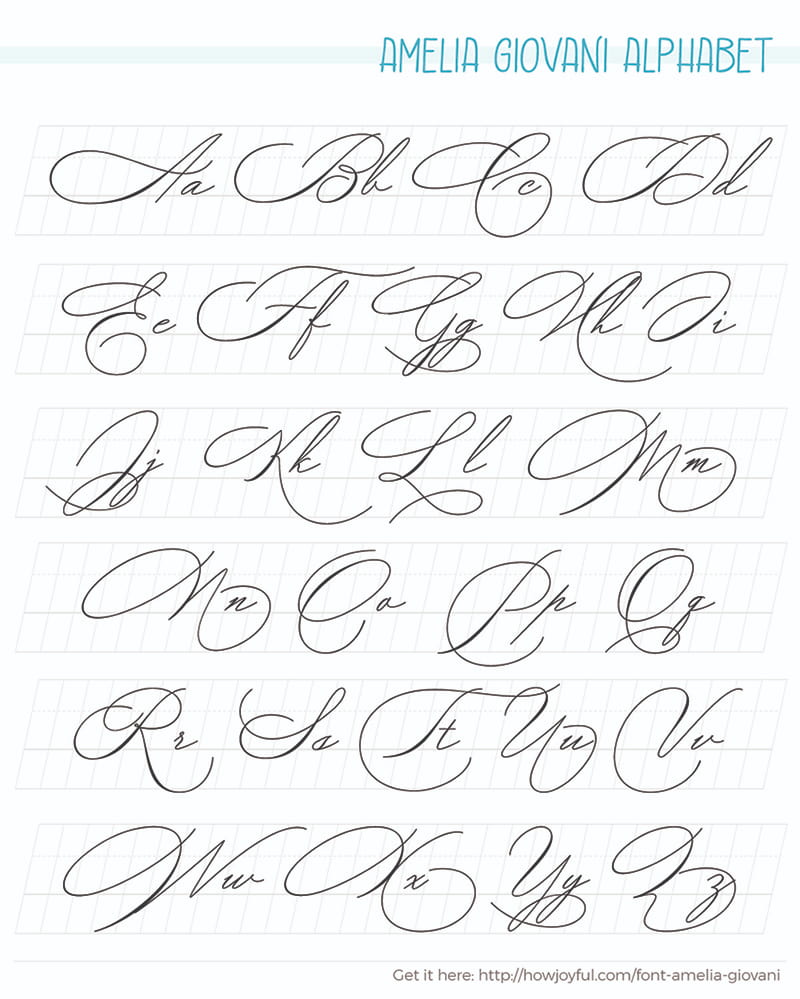
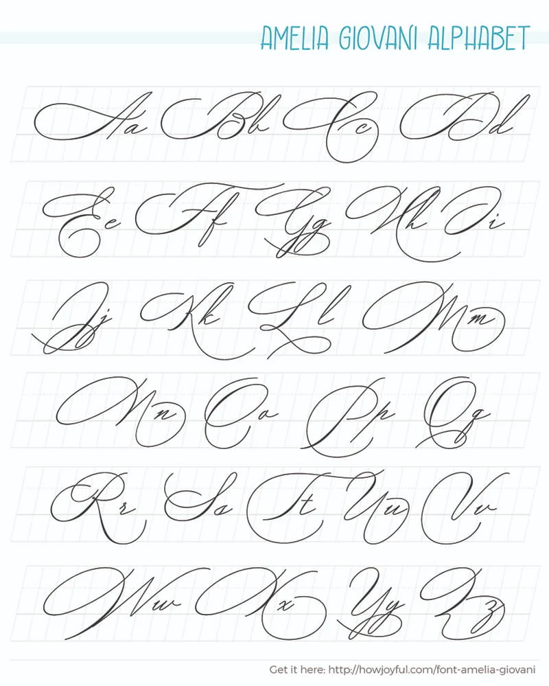
Amelia Giovani Alphabet
Amelia Giovani includes a full set of lovely uppercase and lowercase letters, multilingual symbols, numerals, punctuation, and ligatures.
GET THE FONT «
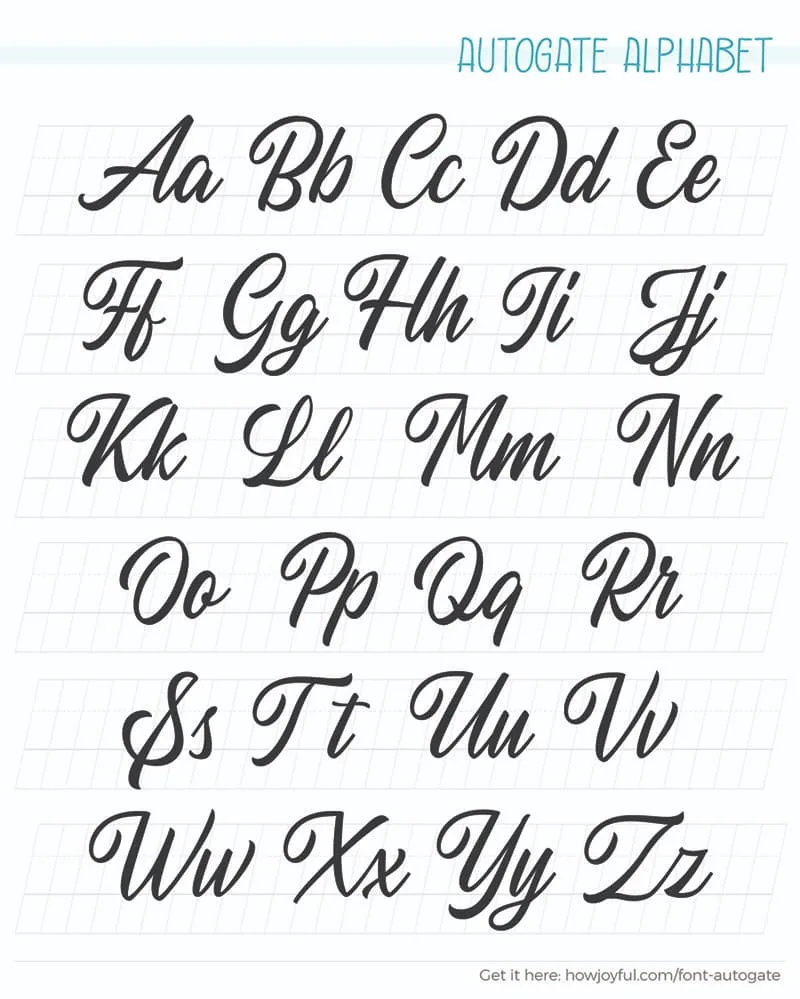
Autogate Alphabet
Autogate Font Duo is a pair of script and sans font that pairs perfectly with a classic feel. The script version has a sign painters vibe.
GET THE FONT «

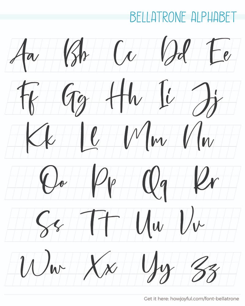
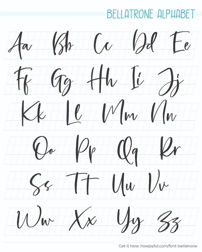
Bellatrone Alphabet
Bellatrone – Modern Script is a script that contains a lowercase, uppercase, symbol, and also supports multi-language.
GET THE FONT «
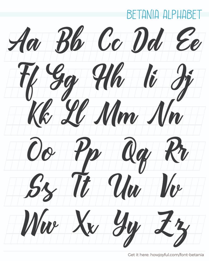
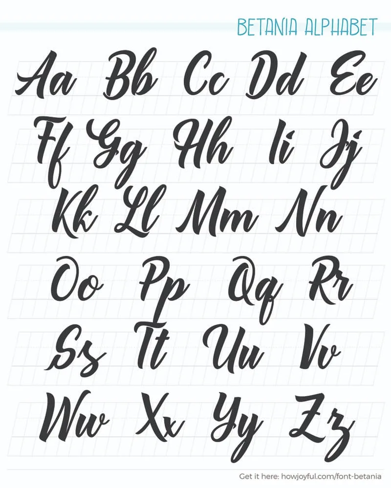
Betania Alphabet
Betania Font is a combination of modern calligraphy letter and sign-painters lettering style. A great font for display text.
GET THE FONT «
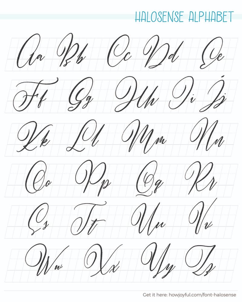
Halosense Alphabet
This modern calligraphy font has a natural handmade feel, created with a small touch of digital to make them flow like water on the river.
GET THE FONT «

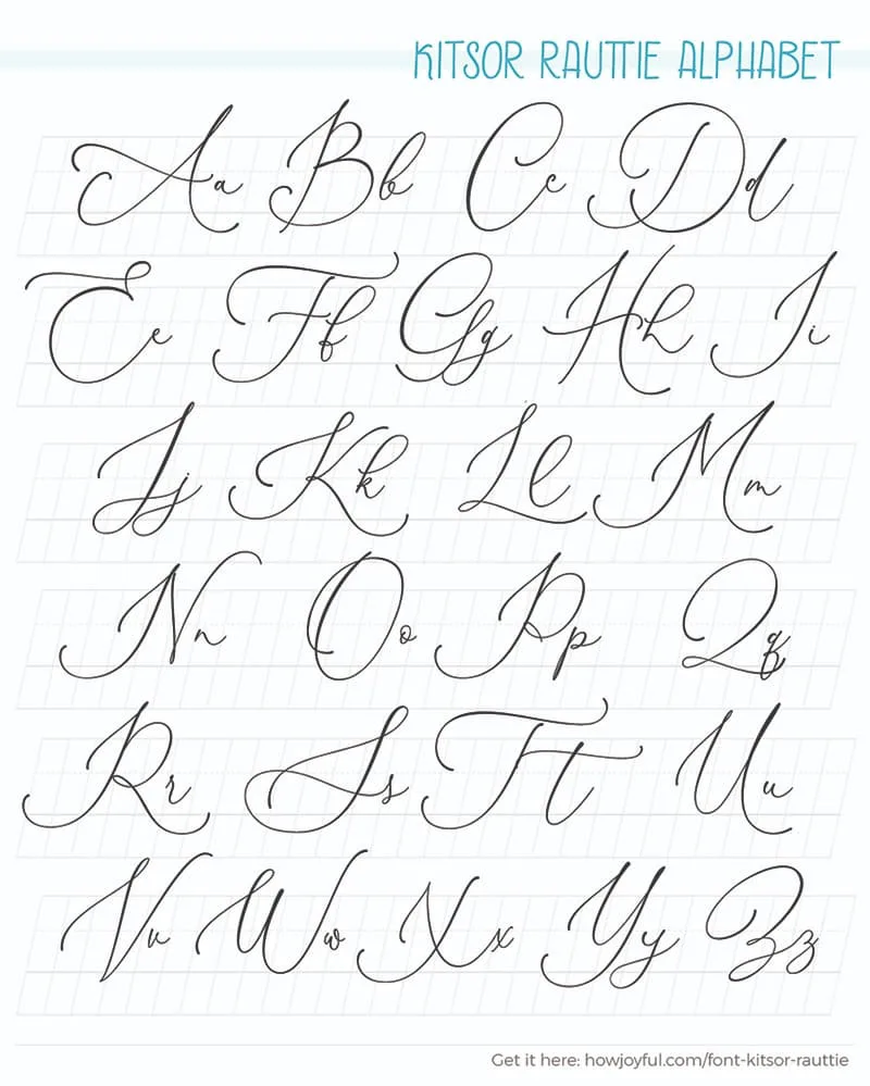
Kitsor Rauttie
Kitsor Rauttie was built with OpenType features and includes beginning and ending swashes, numbers, punctuation, alternates, ligatures, and it also supports other languages.
GET THE FONT «

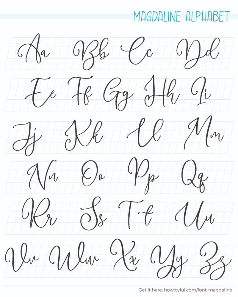
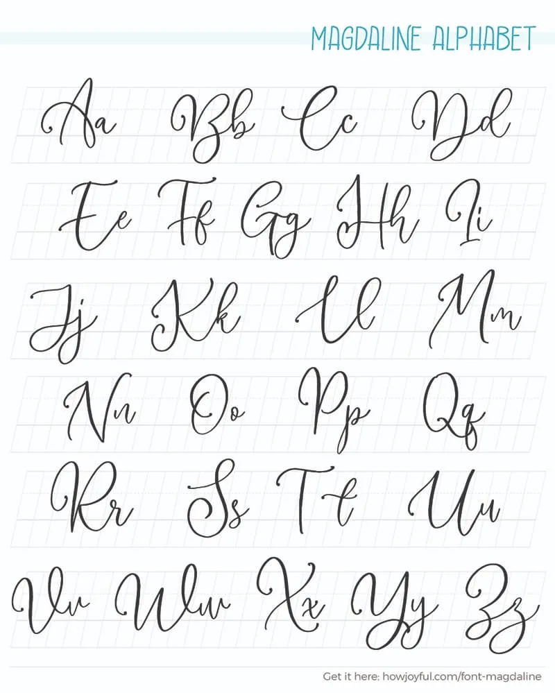
Magdaline Alphabet
Magdaline Script is lovely modern calligraphy that contains a lowercase, uppercase, and symbols. It also supports multiple languages.
GET THE FONT «
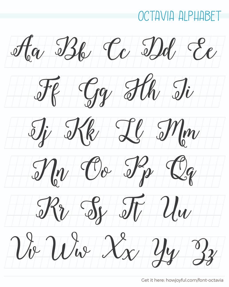
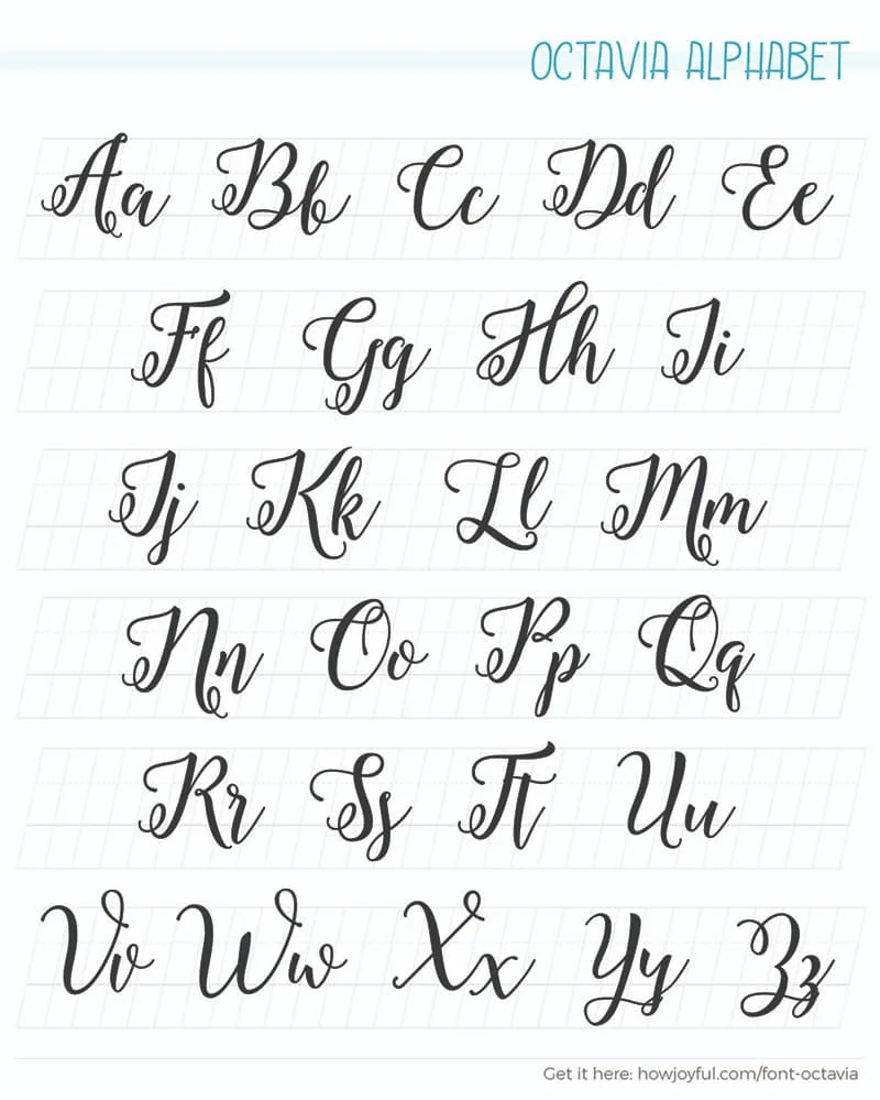
Octavia Alphabet
Octavia Script is another lovely modern calligraphy font that combines the style of classic calligraphic handwriting with digital use.
GET THE FONT «
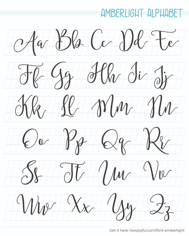
Amberlight Alphabet
Amberlight is a fresh & modern script font with a sweet modern calligraphy-style of letters, decorative characters, and a dancing baseline.
GET THE FONT «

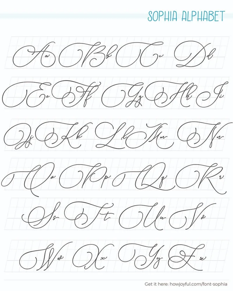
Sophia Alphabet
This is one of my absolute favorite fonts; it features 3 different weights and so many alternates, ending strokes, and beautiful flourishes.
GET THE FONT «

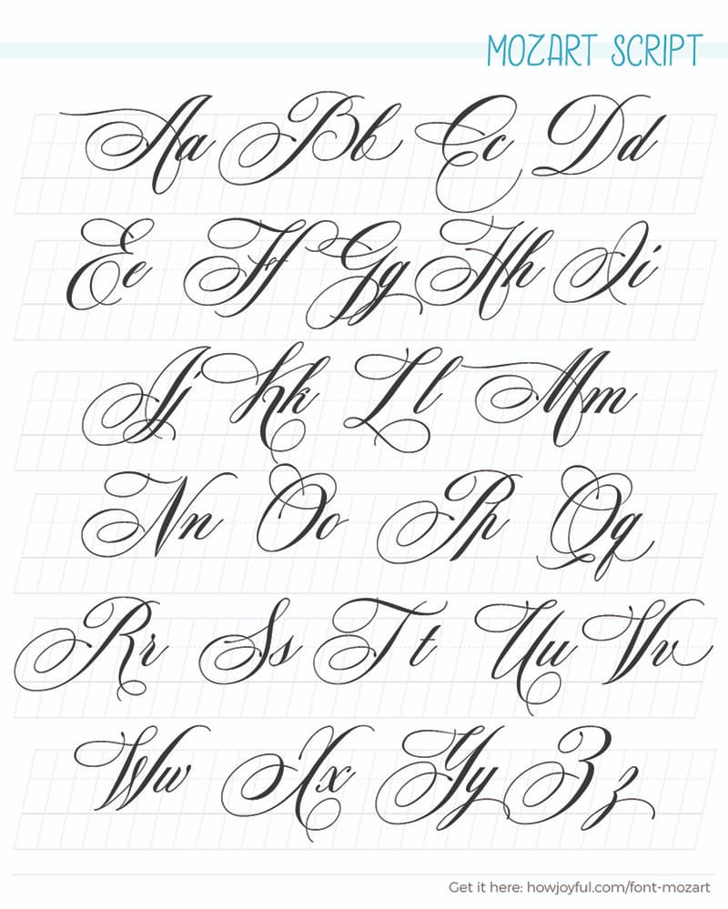
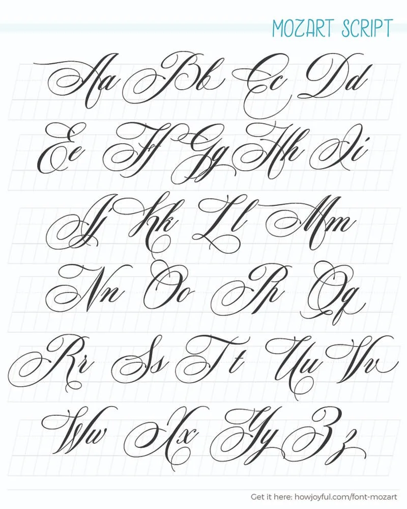
Mozart Script Alphabet
The Mozart Script. Very formal and yet playful, one with six hundred pre-made alternates. Multilingual font-family with 4 widths. Let me call it the “OpenType penmanship” font.
GET THE FONT «
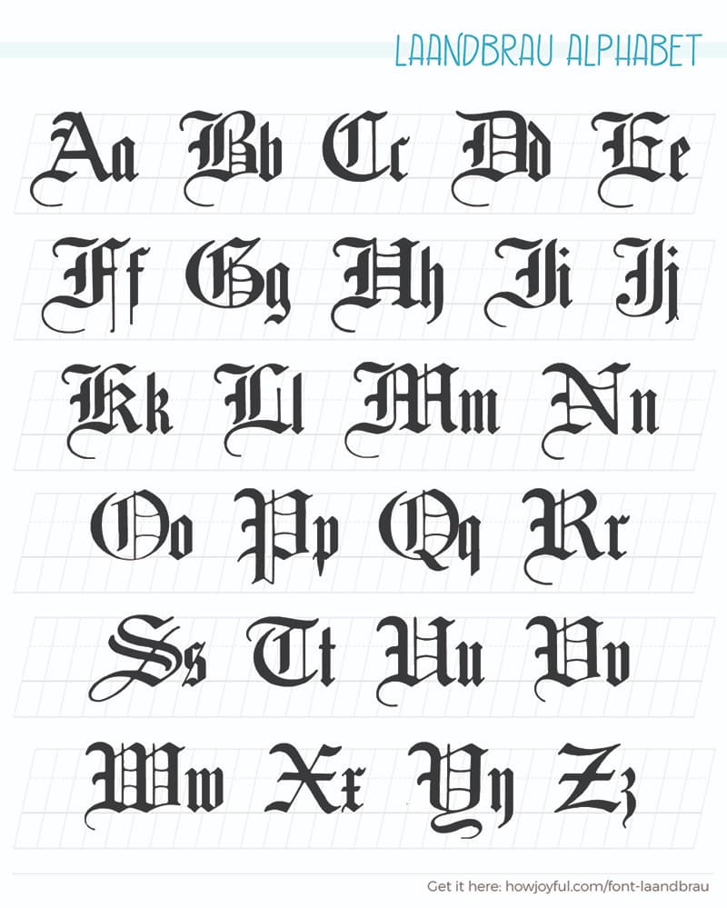
Laandbrau Alphabet
Laandbrau is a clean black-letter typeface, perfect to start dipping your fingers into a more Gothic style of letters.
GET THE FONT «

Tatertot Alphabet
I also had to add a simple handwritten style of font; this one is very playful and childlike, perfect to practice a more relaxed style of letters that are not calligraphy.
GET THE FONT «


Did you like my selection of fonts? I also have a full post where I share some of the best free calligraphy fonts for any project that needs a little extra!
CREATE YOUR OWN ALPHABET
Now that you have all these ideas for alphabets, as well as the best ways to make variations in letters. I would love for you to experiment with picking the details that you like from all the examples and combining them into your alphabet.
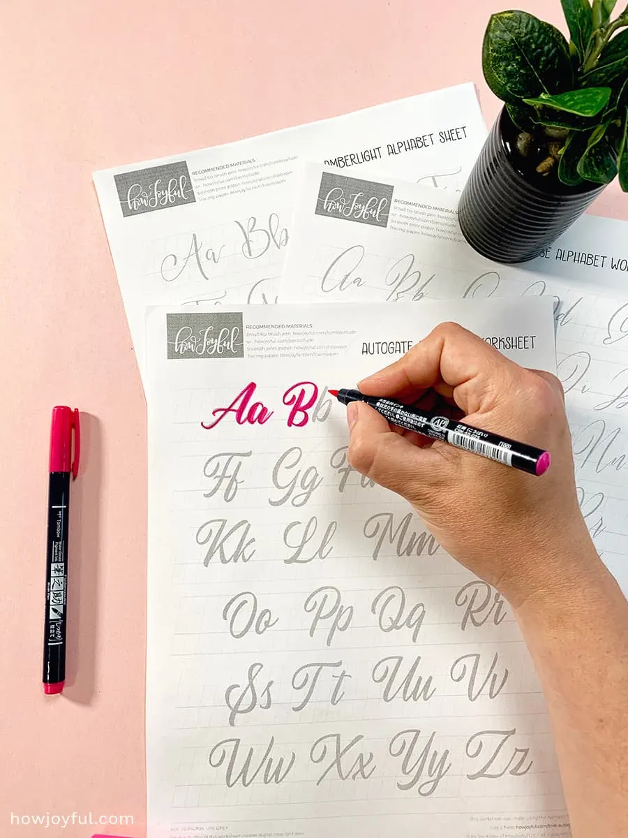
And since I know this exercise would be easier with a worksheet, I prepared a font-based calligraphy alphabet worksheet, so you can print, and trace, to help you practice different styles.
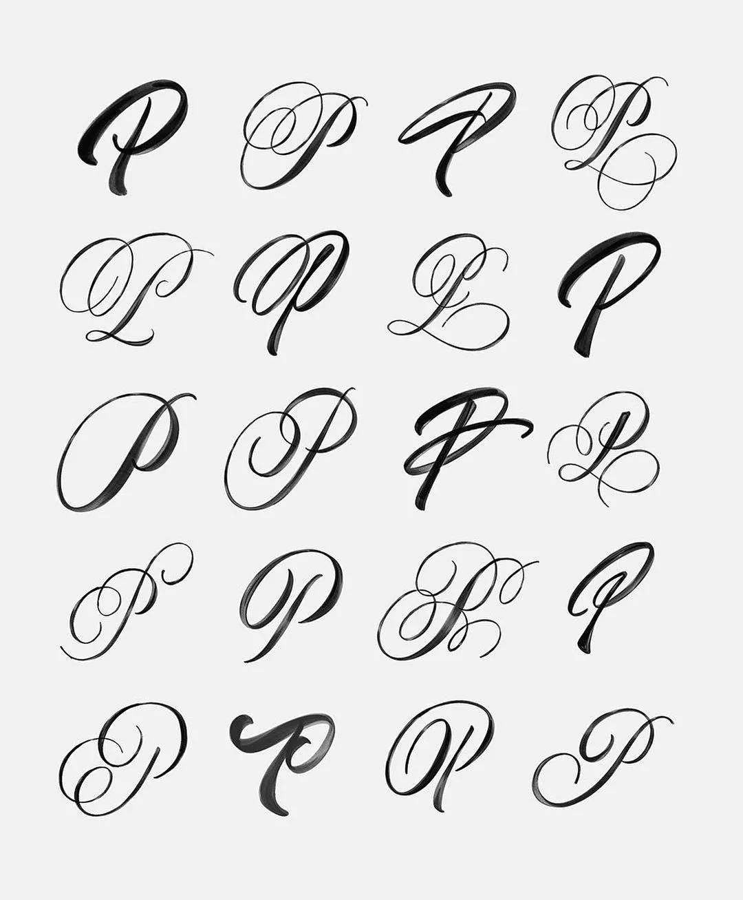
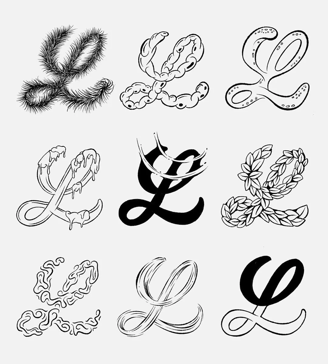
I also wanted to share the pictures below of one of my favorite lettering artist, Michael Moodie, because of the ways that he creates his own styles and letter variations for scripts and creative styles.


FREE Calligraphy alphabet worksheet
All you have to do to download to receive the worksheets straight into your inbox is sign up for the HowJoyful News & Letters, our official virtual happy mail! You will also have access to all the other extra worksheets and workbooks that are available for FREE inside the Letter Vault! All you have to do is fill out the box below!
If you are already subscribed, there's no need to fill out the box again; all you have to do is head over to the Letter Vault and download the FREE font based worksheets.
I hope this post helps you understand letters a little better, and stay tuned for more calligraphy and letter construction material!


Looking for more letter-making goodness?
Take a look at these articles I wrote for you:
- Brush Calligraphy for Beginners Guide
- Calligraphy Alphabets: What are Letter Styles?
- The Difference Between Lettering & Calligraphy
- Typography Terminology Glossary
- The Best Brush Pens for Beginners
- 15 of the Best Books for Calligraphy & Lettering
- A Guide to American Cursive
- 25 of the Best Classes for Calligraphy & Lettering
- A Brief History of Calligraphy
- The Best Paper for Calligraphy
- How to Make Passive Income as a Lettering Artist
I hope you found this useful! If there's anything else that you would like me to cover about calligraphy alphabets, just contact me! I would love to include your questions =]
Have a Joyful day and happy creating!
vineet
Sunday 11th of June 2023
i really like all the information you shared and the tips for calligraphy
Joy Kelley
Tuesday 22nd of August 2023
Thank you! so glad you like it!
Kadie - lifewithkadie.com
Saturday 7th of January 2023
Wow there is so much in this post it will keep me going for weeks! Thanks for all the different alphabet sheets.
Joy Kelley
Tuesday 22nd of August 2023
You are very welcome! So happy it helps!
Vicki
Friday 11th of November 2022
Thank you for sharing. Great and helpful information.
Joy Kelley
Saturday 19th of November 2022
You are very welcome! =]
Kiki temz
Tuesday 19th of January 2021
really kool page
Joy Kelley
Saturday 27th of February 2021
Thank you!
Patricia
Monday 20th of April 2020
I loved all the different alphabets in the sheets, thank you for making so many freebies, I am impressed - I like that you have everything to re-download in one place
Joy Kelley
Friday 10th of April 2020
I am so happy you liked them, Patricia! And keep coming back to the letter Vault! I am adding new worksheets each month =] xo, Joy-