


Ever wondered where Calligraphy comes from? In this brief history of Calligraphy post, we will dig into some books and go back to the beginning of writing history so that we can understand the origin of letterforms.

If you can see, then chances are you are being exposed to letterforms daily, even though occasionally, we take them for granted and pay little to no REAL attention to them.
In our everyday life, we are dependent on letters to navigate the world, express ourselves, as well as communicate with others.
Letters allow us to convey information, set warnings, or consume and produce education, like this post you are reading right now.
In this digital era, it's easier than ever to have access to different fonts and tools that allow us to create from simple documents to intricate work of art.
But where do letters come from, and how have they evolved over time?
In this post, and with the help of a handy list of amazing books (check the full list of books at the bottom) I will cover all these points in the history of Calligraphy.
So let’s start with the basics!
THE MEANING OF THE WORD CALLIGRAPHY
Calligraphy means beautiful writing and comes from the Greek “καλλιγραφία” words “beauty” (Kallos) and “to write” (Graphein).
And while the meaning of the word is “beautiful writing” I think we can agree that Calligraphy is much more than just a way to write words in a beautiful way.


Calligraphy is a fine art, like painting, sculpture, drawing or photography. It’s a way of seeing life and telling what you see.
Through calligraphy, you can learn about proportion, positive and negative space, depth perception, and light.
Through calligraphy, we can elevate a message, since people respond to the qualities of a well-executed piece. That brings a special punch to the intellectual meaning of the words.
A well-constructed piece has three dimensions, a fine art, a craft, and a literary art.
It’s up to the Calligrapher to bring all of them together as a tricking idea with a high level of craftsmanship of fine materials and a carefully chosen message, but what makes calligraphy so meaningful is passion, and the way each individual artist can express him/herself through the words and lines of this art form. (1)


CALLIGRAPHY THROUGH THE YEARS
Ever since humans began speaking, they have supplemented their sounds with gestures. Writing came as an extension of this gesturing — A way to make motion visible, memorable, and lasting.
For thousands of years, people wrote with whatever tools they had on hand, whether that was sharp objects, to scratch, dent, or color substances from vegetables to use as inks and powders.
Writing letters with a pen is only ONE of many ways that people have thought up to make speech visible.
The origin of Calligraphy with brushes dates back to ancient China during the Shang dynasty becoming more common during the Han dynasty (206 BCE – 220 CE) where it was expected for all educated men and some women to be proficient at it.


The origin of the Western script evolved from Phoenicia in about 1200 BC. adapted in the eighth century by the Greeks, those letterforms would continue to evolve and would be borrowed by the Etruscans and in turn by the Romans. (2)
All the rest of the Western scripts (or styles) evolved from the Roman originals.


HAND CATEGORIES
Some of the most important scripts can be grouped into categories; below you can also see a graphic with a timeline for most of the described hands.


Roman and late Roman scripts
- Imperial Capitals: Roman hand used in brush-drawn and carved forms, the letterforms are the basis of many modern capitals.
- Rustic capitals: First-century script used in manuscripts, sign written and carved forms.
- Square capitals: Late Roman capitals, reserved for non-Christian deluxe manuscripts.
- Uncial and Artificial uncial: Latin version of the Greek Uncial with rudimentary ascenders and descenders, used by the early Christian Church.
Insular and National script
- Insular Majuscules: Combines Uncial and half Uncial elements, developers by Isaiah-Northumbrian Celtic monks.
- Insular Minuscule: Cursive form of the Insular Majuscules used for documentary work.
Caroline and Early Gothic scripts
- Caroline Minuscules: Reformed half Uncial; the established hand of the Frankish Empire, the model for 15th-century Humanism minuscules.
- Early Gothic: Compressed version of the Caroline Minuscules used in the 12th century, presaged later Gothic Scrip.
Gothic scripts
- Textura Quadrata: Fully compressed Gothic letter from the early 13th century, characterized by a diamond terminal of minims.
- Textura Prescisus: Twin script of the Quadrata, characterized by flat feet on minims.
- Gothic Capitals: Accompanying capitals for Textura minuscules.
- Lombardic Capitals: A built-up, prestige display and Versa capital, usually based in conjunction with Quadrata or Prescisus scripts.
- Bastard Secretary: A cursive gothic script used only for vernacular and documentary work.
- Bâtarde: The French version of the Bastard Secretary.
- Fraktur: German, late bastard script with many Textura features, with Schwabacher, it remained in use until the mid 20th century.


Italian and humanist scripts
- Rotunda: Italian hand; contemporary with a Gothic script, rounder and more open than other northern European hands.
- Rotunda Capitals: Accompanying capitals for Rotunda minuscules.
- Humanist Minuscule: Renaissance hand influenced by the Caroline minuscules, the letterforms are the basis of much modern printing type.
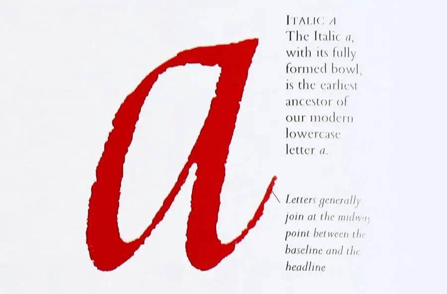
- Italic: Cursive for of the Humanist minuscules; used in modern type for text in parenthesis and annotations.
- Humanist Capitals: Accompanying capitals for Humanist and Italic minuscules, pen-drawn derivatives of Imperial capitals.

Post-Renaissance scripts
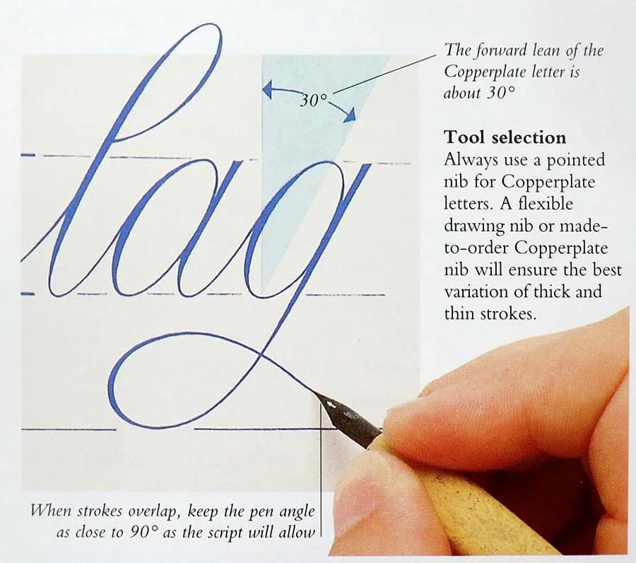
- Copperplate: Extreme form of a cursive script with most letters linked, derived from Italic and influences by Copperplate engraving.
- Copperplate Capitals: Accompanying capitals for Copperplate minuscules.


THE EVOLUTION OF LETTERFORMS
The Celtic scribes of the Dark Ages and the Gothic scribes of the Middle Ages worked indoors and used small pens made out of feather quills, writing small letters. Their main concern was to copy, glorify, and preserve the text of the Christian religion.
During the Renaissance, Greek and Roman ideas were rediscovered, and with them, the formally carved capitals of classical inspiration and the pen capitals of early manuscripts were brought back to the spotlight.
At the same time, the invention of movable type and the adoption of papermaking technology from Central Asia helped the printing press to replace the scribe as the main way to produce and reproduce books.
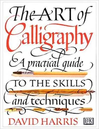
BOOK RECOMMENDATION: A great resource to check on the timeline of each of the original scripts in this timeline from the book The Art of Calligraphy, a practical guide to the skills and techniques by David Harris. It also includes instructions on how to create each of those historic alphabets. GET IT HERE


As David Harris stated in his book, no reference to the historical mechanics of Calligraphy is completed without a reference to Edward Johnston’s Foundational Hand and it’s simplicity and integrity.
Historically, Foundational hand belongs to the early 20th century, however, the basis for the script is a manuscript dating for rage year 966, the Ramsey Psalter. It is believed to have been produced by scribes at Winchester.
The Ramsey Psalter was written in a hand now known as the English Caroline Minuscule, and Anglicized version of Frankish Caroline Minuscule.
For three centuries, master typographers and their apprentices perfected the design, cutting, casting, and setting of mechanically perfect type fonts.
This new visual purity of type became the new standard of reading formats for an in recently literate public.
As more people read, more and more people wrote, as mail delivery became more reliable, writing letters became a necessity to communicate in the distance. People modeled their handwriting as it was considered a sign of status and education.
During the industrial revolution Calligraphy hit the lowest point in history, as the professional scribe’s profession disappeared and manufactured books, textiles and housewares drove handmade things out of fashion.
Calligraphy was revived again during England’s Arts and crafts movements, along with many medieval techniques for cutting pens, mixing inks, and laying gold leaf to name a few.
Calligraphy and the related book arts began to attract designers and visionaries who revitalized the typeset page by reconnecting it to the handwritten manuscripts.
Another wave of interest in calligraphy swept North America in the 1970s as cartridge pens, markers and copies brought the mechanics of the craft to the threshold of the hobbyist. (2)
Amateurs found themselves with access to standardized, reliable, and inexpensive materials, to write, practice and color.
The Calligraphic talents of this generation of Artists then fueled the alphabet innovations of the digital typeface revolution.
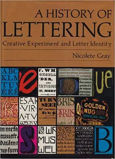
BOOK RECOMMENDATION: If you want to dig deeper into history and the development of scripts I recommend A history of Lettering: Creative experiments and letter identity by Nicolete Gray – While the book does have images and references, it is very word-heavy and describes the evolution and different experiments that lead to many styles and hands to be born through the decades. GET IT HERE

THE HISTORY OF COPPERPLATE
As we are focusing more on Modern Calligraphy, we have to pay some special attention to the inception of Copperplate.
The development of Copperplate as a calligraphic style must be studied within the context of European history.
Two major factors combined to establish the importance of Copperplate in the 18th century: The stature of England as an important economic power and the development of metal plate-engraving.
By the mid-17th century, England was well established commercially with a huge upsurge in trade.


With the rise of a business class, came a need for scribes, educated in record keeping and writing.
Education flourished, and writing schools were established where young men could learn accounting and penmanship. By the beginning of the 18th century, the age of the English masters was in full bloom.
Masters seeking pupils to take under their wing took to printed advertising to attract more suitors to their classes. Oftentimes with elaborate and beautiful pieces of art that appealed to their skills as teachers, penmen, and scholars.
Many writing masters published copy books, printed text from which their students could copy the calligraphy of the (self-proclaimed) master scribe. These books served multiple purposes of attracting students, advertising the penman’s abilities with their tools, and at the same time show light to the lack of skills of the competition.
The method by which these books were reproduced was copperplate engraving, which consisted of incising fine lines onto a metal printing plate with a sharpened steel tool called burin.
The penman’s designs were transferred onto the plate in reverse by the engraved and could be corrected and adjusted before printing.
In 1570, the first writing book – a translation of Jean de Beauchesne’s French copybook, “A Booke Containing Divers Sorts of Hands”, published in Paris in 1550 – was engraved in England. (3)
As you might have guessed, the Copperplate hand developed from this new engraving method.
The most important innovation was that for the first time in Copperplate, all letters in a word were linked together. This made this particular hand faster to write and more practical.
The 17th and 18th centuries also saw the publication of dozens of elaborate and highly ornamented books by such penmen as Edward Cocker (1631-1676) and John Seddon (1644-1700), and while numerous copies were produced, only a few survived.
An invaluable source of Copperplate calligraphy is available thanks to George Bickman. He called upon twenty-five of the finest penmen in England between 1733 and 1741, to provide him with examples of their work. 212 of these engraving were later bound in book form to bring to life “The Universal Penman”
The calligraphic style that predominates in “The Universal Penman” which we call “Copperplate” was known in the 18th century as “Roundhand”.


In a way, the shapes of the letters were determined by the printing method. The combination of the pointed burin and the hard metal plate led to changes in letterforms from the italic and secretary hands of the 15th and 16th centuries. Curves became rounder, letter slant increased and the contrast between heavy and fine lines became more pronounced.
In England, “Roundhand” quickly gained favor as a business hand because of its speed, clarity, and legibility, eventually replacing many of the Humanist hands when it came to business, record keeping and important documents.
Copperplate letterforms survived through the 19th century, although the perception of the script of Beckham and his contemporaries was not equaled.

The surge of education in the 19th century led to the need for teachers to teach handwriting to the masses, a need that led to the dilution of the calligraphic mastery and ornamentation in favor of speed and legibility.
The invention of the ballpoint pen in the 20th century led to the end of an era, before, students were judged not only by the content of their work but also on their writing techniques.
IN-DEPTH POST: If you are interested in leaning more about cursive, I have a full guide with a FREE Cursive workbook! Check out everything you should know about Cursive here.
Slowly, the beauty and elegance of the writing word, as the tools changed, banished. To make room later for the word processor.
But as we now know, this was not the end for this beautiful art form, today more than ever the interest for the handcrafted quality and the handwritten word has given Calligraphy and Copperplate another revival.


Other styles like Spencerian and Edwardian, have been continued to be taught, but since they continue to be relatively inflexible with established letterforms to maintain their purity.
Modern calligraphers have been more encouraged than ever to develop their own personal styles, with their bases in older scrip styles, but adding their own expression to the strokes and letterforms.
And this movement that we now call Modern Calligraphy.
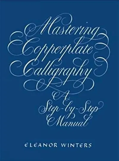
BOOK RECOMMENDATION: If you want to check more about Copperplate with a dip pen, I recommend Mastering Copperplate Calligraphy: A Step-by-Step Manual by Eleanor Winters. Its has great examples and instructions to start with Copperplate. GET IT HERE


MODERN CALLIGRAPHY
While most script calligraphic styles considered “Modern calligraphy” today have evolved from Copperplate and other script style hands.
Twenty-first-century calligraphers frequently create their own alphabets to reflect their personal aesthetics and personalities, using daring layouts and innovative materials, seeking inspiration in everything around them.
The notion that there is a right and wrong way to write letterforms seems outdated. (7)
BUT, we have to be careful though, as we ride this new wave, we still have to remember the rules that make letters legible and recognizable.
We also should always remember to look back to those who set precedent for the techniques and shapes we still use.
We have to celebrate and appreciate their journeys, and the path they paved for Artist today, as much as we now respect self-expression with the tools we continue to use and those that have evolved over time.

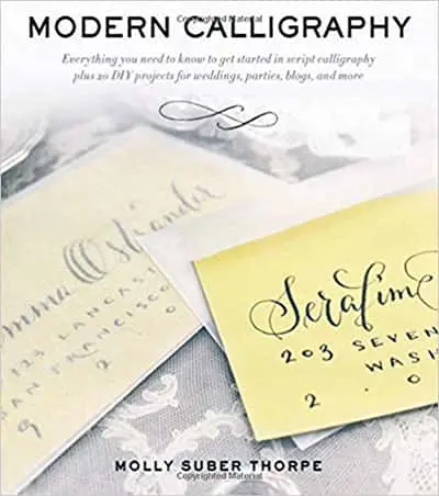
BOOK RECOMMENDATION: If you want to check a book about Modern Calligraphy I recommend Modern Calligraphy: everything you need to get started by Molly Suber Thorpe. GET IT HERE

WRAPPING IT UP!
I’ve heard so many times that history doesn't matter when it comes to Calligraphy and Lettering, but knowing the past, I believe, is the only way to fully appreciate the present.
In order to put this post together, I read a bunch of books, and I was both surprised and inspired to keep reading more about how letters have developed and evolved from the very rudimentary set of Roman letters.
These evolutions should be celebrated and known by all lettering artist and not reserved just for those that have “interest” in finding more about it.
It could just be that I am nerdy by nature, but I loved this little immersion I did in all these different books. And if you are also interested in reading more or practicing some of the styles covered in this post, check out the list of all the books I referenced below.


BOOKS CITED IN THIS POST:
- (1) Learn Calligraphy: The complete book of Lettering and design by Margaret Shepherd
- (2) The Art of Calligraphy, a practical guide to the skills and techniques by David Harris
- (3) Mastering Copperplate Calligraphy: A step by step manual by Eleanor Winters
- (4) A history of Lettering: Creative experiments and letter identity by Nicolete Gray
- (5) Script lettering for Artist by Tommy Thompson
- (6) Brush Lettering: Step by step by Jim Gray & Bobbie Gray
- (7) Modern Calligraphy: everything you need to get started by Molly Suber Thorpe
- (8) The Art of Chinese Calligraphy: The essential stroke-by-stroke guide to making over 300 beautiful characters by Yat-Ming Cathy Ho


If you have any other suggestions for books or if you find I've missed something in this post, don't hesitate to contact me!
I hope you have a wonderful day and keep creating!
Natalia
Wednesday 22nd of January 2020
Awesome post! Keep up the great work! :)
Joy Kelley
Friday 24th of January 2020
Thank you so much Natalia =]